Reborn
A digital accessibility focused art app that encourages users to reframe creative obstacles as strengths.
Individual Project
Role: Lead Product Designer
Timeline: 6 Weeks
Tools: Figma
The Challenge
Many digital art tools are not designed with accessibility in mind, making creative expression difficult or frustrating for users with different abilities. Features like text size, contrast, and navigation are often fixed, forcing users to adapt to the tool instead of the tool adapting to them. The challenge was to design a digital art app that feels intuitive and empowering for everyone, not just a narrow group of users.
The Opportunity
This project was an opportunity to design accessibility as a core experience rather than an afterthought. By building in flexible controls and inclusive interactions, the app could support a wider range of users while still feeling visually intentional. The goal was to show that accessible design can be both functional and emotionally engaging, without sacrificing creativity.
Process
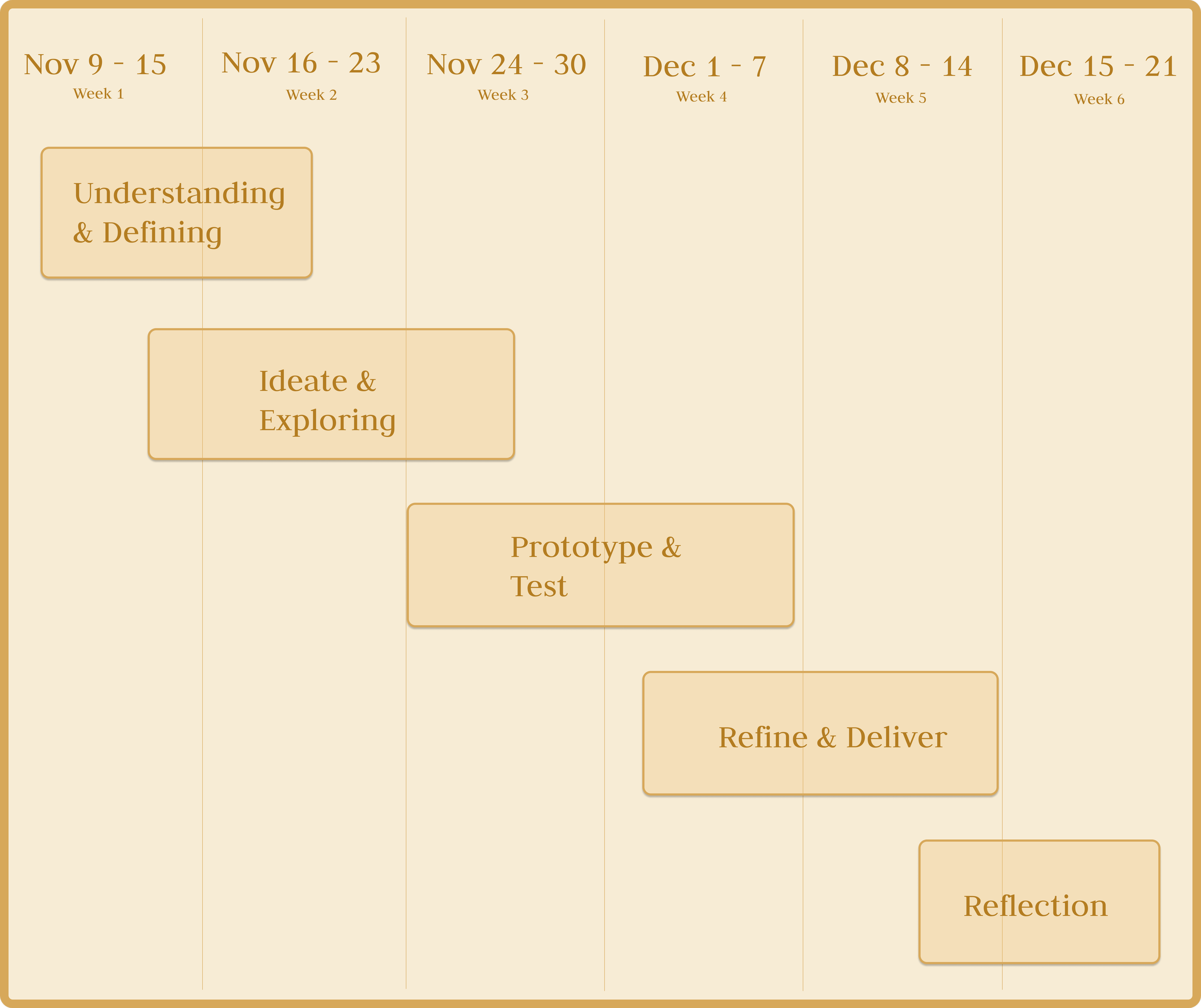
Project Timeline
Research & Understand
User Research: Identity & Creative Growth
During interviews, many participants shared that beyond accessibility barriers, they struggled with seeing their creative journey reflected or valued in digital tools. For users with disabilities in particular, creative platforms often felt like fixed systems that didn’t acknowledge growth, experimentation, or personal progress.
User Testimonials
Individual with a Disability
“A lot of tools make me feel like I have to be perfect right away. When I struggle, it feels like proof that I don’t belong there. I wish there was a way to see my progress as part of my identity, not something I need to hide.”
Individual with a Sibling Who Has a Disability
“My sibling loves creating, but they get discouraged easily because they can’t see how far they’ve come. Their journey is full of effort, not failure, but the apps don’t show that. It would mean a lot if their growth was visible and celebrated.”
Individual Without a Disability
“Even for me, creative apps feel like you either succeed or you don’t. There’s no space to show evolution. Seeing your work change over time would make the process feel more personal and motivating.”
Key Insight
Many users feel excluded not only by inaccessible interfaces, but by tools that fail to acknowledge personal growth
Users with disabilities often struggle to view their creative journey as a strength rather than a limitation
A lack of visible progress makes it harder for users to stay motivated and continue pursuing creative work
Creative platforms tend to prioritize final outcomes over process and evolution
Design Connection
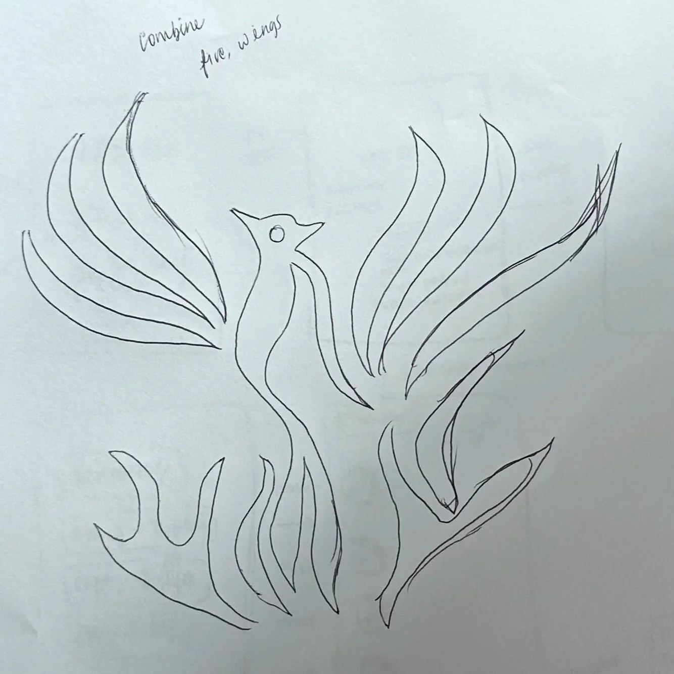
This insight directly informed the evolving logo system within Reborn. By allowing users to continuously add to and reshape their logo over time, the app visually represents creative growth as something ongoing and personal. Each iteration becomes a marker of progress, reinforcing the idea that growth, not perfection, defines creative identity.
Ideation & Exploring
Userflow: Brainstorming User’s Creative Journey
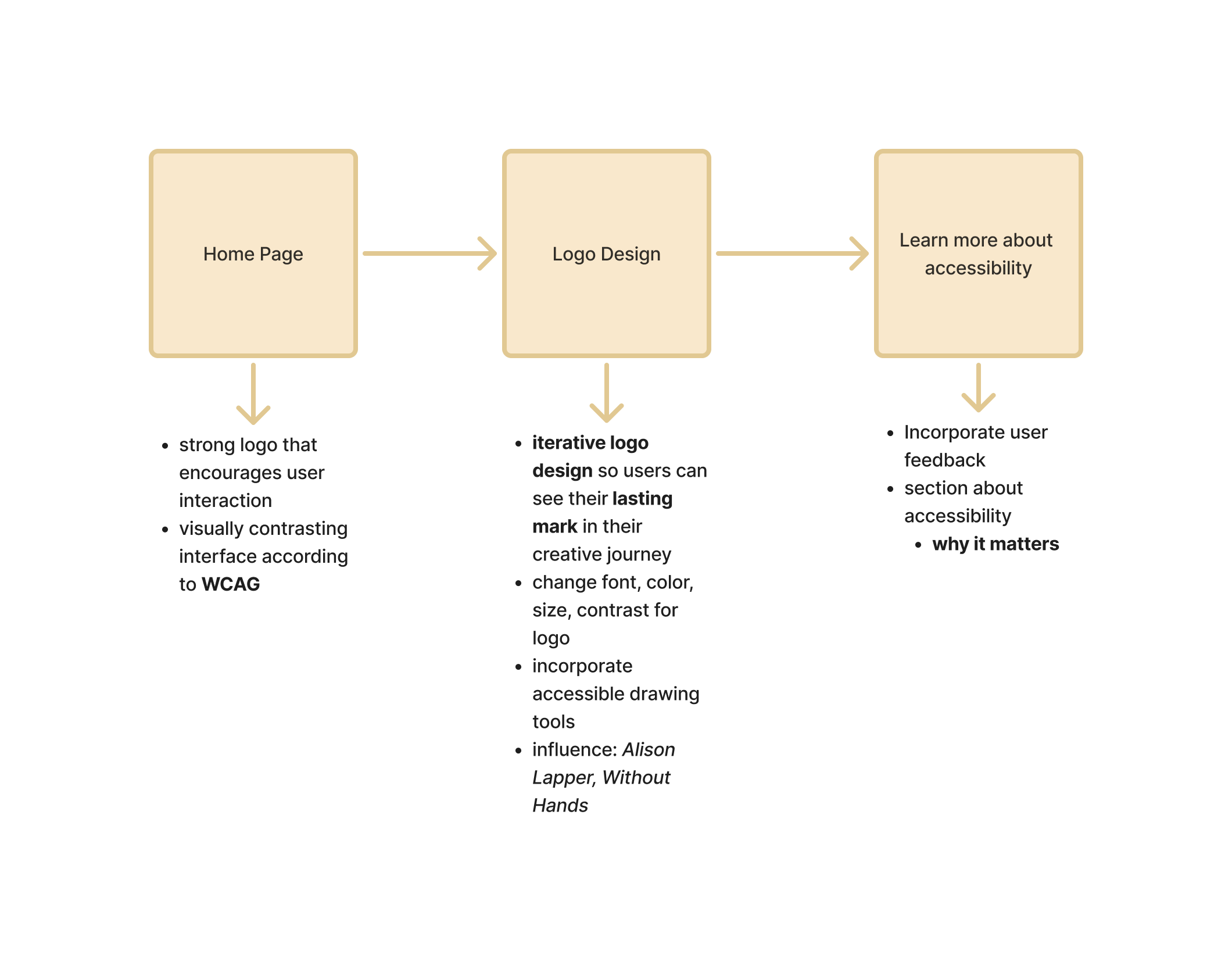
To understand how users would move through the app, I created an initial flow mapping key features. The flow begins at a central creative dashboard, moves into shared or personal spaces for accountability and expression, and ends in a profile area where users can view progress and evolving identity markers.
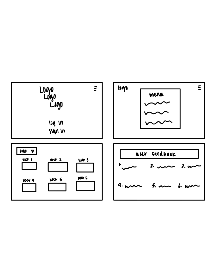
Paper Prototype: Brainstorming User’s Creative Journey
To explore how users move through the app, I created a paper prototype that maps a creative journey from a central dashboard into personal or shared spaces for accountability and expression, ending with a profile area that reflects progress and evolving identity.
Wireframe
Structure: Incorporating design into accessibility
Reborn’s wireframe experiments with structure and interaction to better understand how users move through the experience.
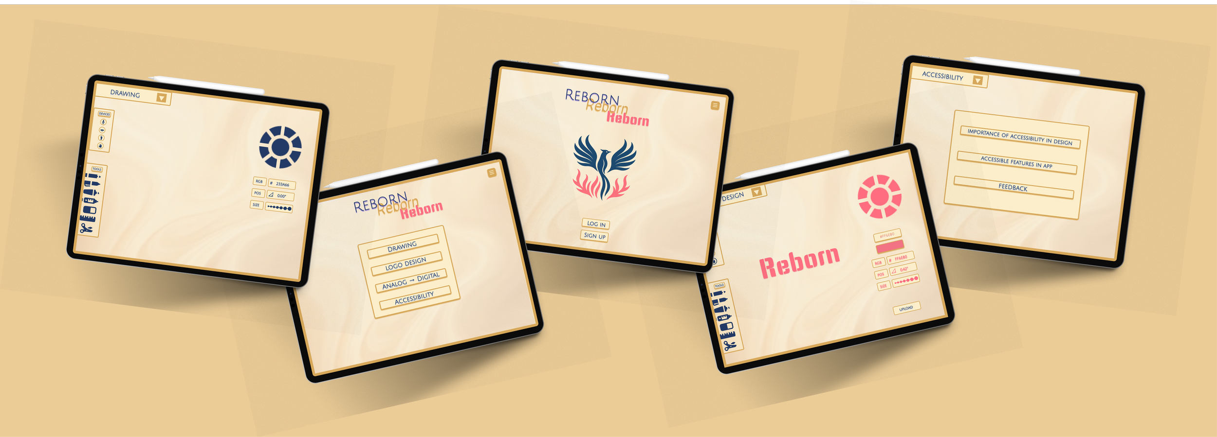
Reborn App: Low-Fidelity Prototype
Home + Login Pages
The home and login pages are designed to feel calm and intuitive, reducing friction so users can easily enter their creative space. The minimal structure helps users feel grounded from the very first interaction.
Drawing + Feedback Pages
The drawing and feedback pages balance expression and reflection by centering creative work while keeping tools and input clear and accessible. Together, they support creative flow while encouraging thoughtful contribution.
Logo Design: Low-Fidelity Prototype
Refinement
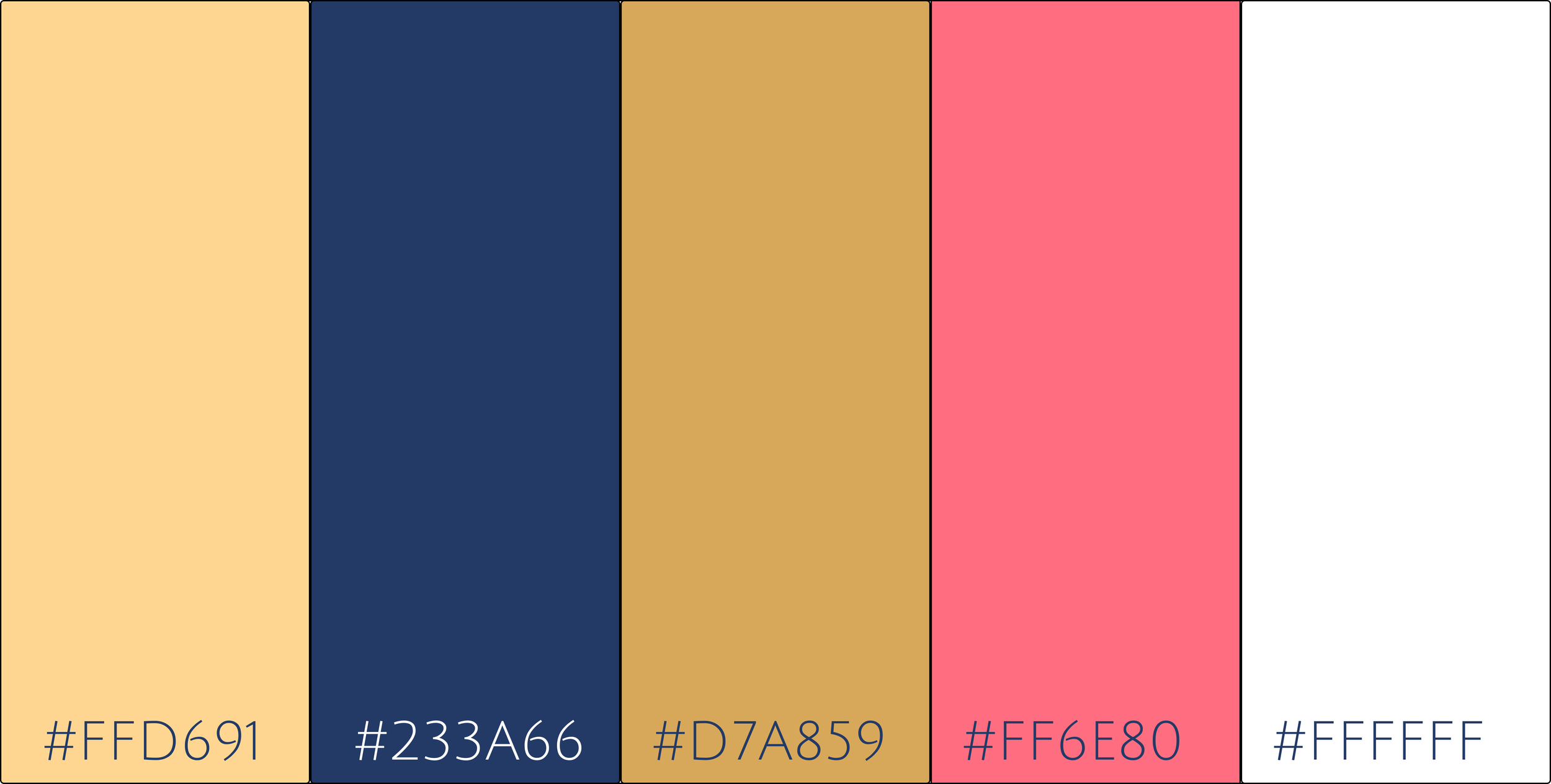
Visual Schematics: Color & Font
Color
Font
Julius Sans One
Reborn App: Hi-Fidelity Prototype
Title / Display 36px
Section Header 25px
Body Small 20px
ABCDEFGHIJKLMNOPQRSTUVWXYZ
abcdefghijklmnopqrstuv
#0123456789
Reflection
Highlights
Designed a calm, accessibility focused creative platform centered on self expression and reflection
Developed low fidelity prototypes that explored user flow, creation, and feedback under a constrained timeline
Conducted usability testing and incorporated participant feedback into iterative design decisions
Users responded positively to the minimal entry flow and structured feedback system, noting reduced overwhelm
Opportunities
Bring the app to life by supporting multiple stylus inputs so creative tools respond to different hardware interactions
Build higher fidelity prototypes to better test accessibility features and drawing interactions
Expand usability testing to include a wider range of accessibility needs and creative backgrounds
Iterate further on tool clarity within the drawing experience
Conduct a competitive and accessibility audit to better position Reborn within existing creative tools
Usability Tests
Testing Setup
Conducted usability testing with 4 college students using Reborn’s logo and app low-fidelity prototype
Each session lasted approximately 20–30 minutes
Participants navigated the home, login, drawing, and feedback pages
Sessions included guided tasks followed by open-ended discussion
Key Objectives
Understand whether users could easily enter and navigate the app without feeling overwhelmed
Evaluate if the drawing experience supported focus, expression, and accessibility
Assess how users perceived the purpose and value of providing feedback
Discovery
Participants found the entry flow intuitive and welcoming, which lowered the barrier to starting. The drawing page helped maintain creative focus, though users wanted clearer guidance around tools and accessibility features. The feedback page felt intentional and supportive, with several participants expressing interest in seeing how their input would influence future iterations of the platform. The simple logo stuck out the most as visually it was exciting and at a smaller scale could still be seen.