WebCheckOut
Redefining intuitive design for the IDM Equipment Catalogue.
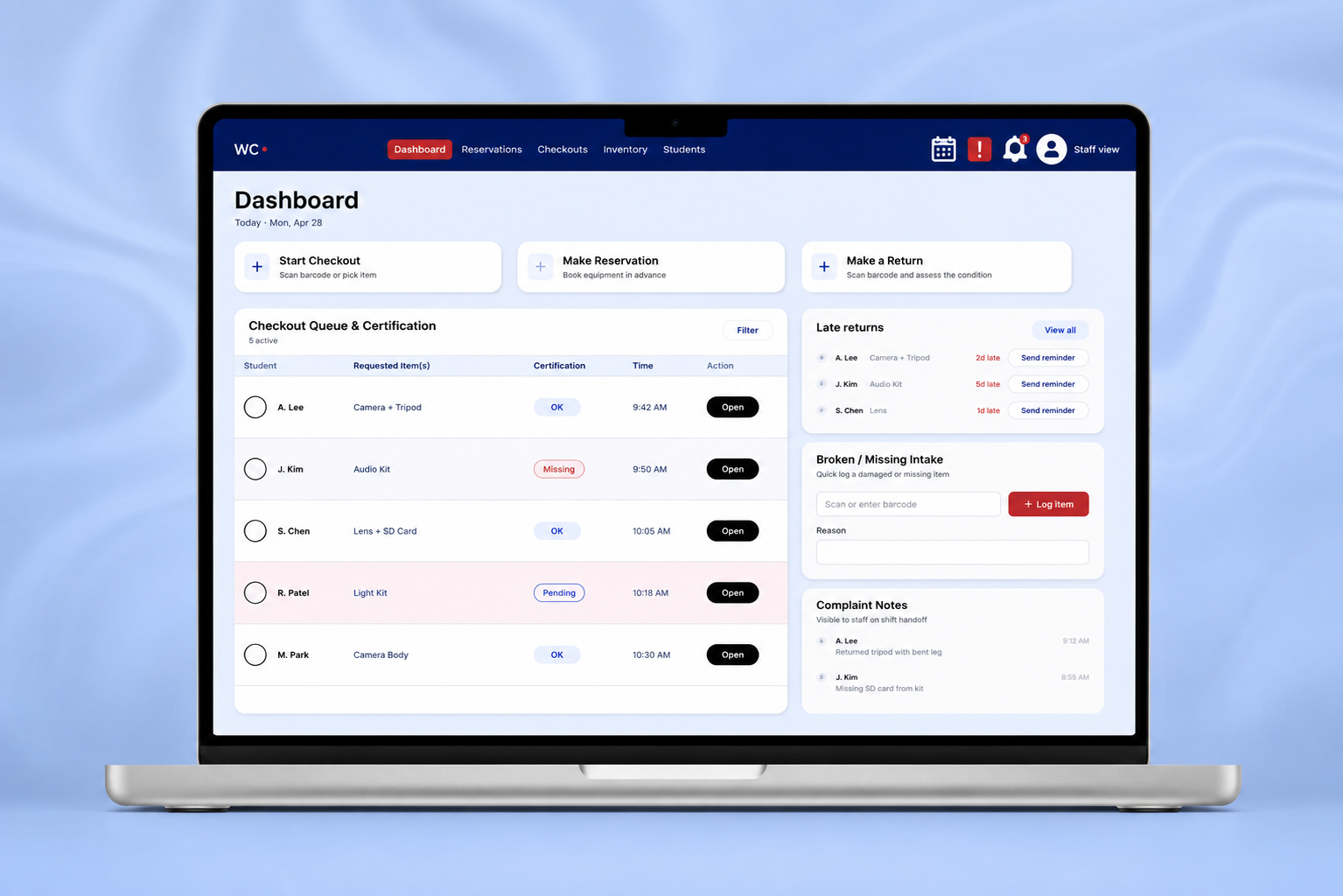
Individual Project
Role: Co - Product Designer Timeline: 4 Week Tools: Figma, Adobe Creative Cloud
Overview
WebCheckout is a university equipment rental platform designed to simplify how students browse, reserve, and manage access to technical equipment.
As the lead designer-developer, I owned the end-to-end redesign of the platform experience, restructuring the information architecture and designing responsive workflows across desktop and mobile. I also developed scalable filtering systems and reusable UI patterns to improve equipment discoverability and streamline the reservation experience for students navigating high-volume inventory systems.
Impact
Reduced friction across multi-step reservation workflows for student equipment rentals
Improved equipment discoverability through redesigned filtering, categorization, and search experiences
Created a scalable design system with reusable UI components through A/B testing for future platform expansion
Translated complex inventory and checkout processes into a more intuitive student-facing experience
The Challenge
IDM equipment room staff need a reliable, staff-centered checkout system that reduces manual cross-checking and speeds critical tasks, because current WebCheckout glitches and interface clutter cause delays, duplicate work, and inconsistent handoffs.
The Opportunity
Simplify the checkout workflow by making core tasks faster, clearer, and more accountable. The redesign focuses on reducing duplicate work, improving system visibility, and helping staff complete checkouts, reservations, and equipment updates with less friction.

Process
UX Research → UX Analysis → Ideation → Prototyping → User-Testing → Refining → Reflection
Research & Understand
User Interviews: Understanding User Pain Points
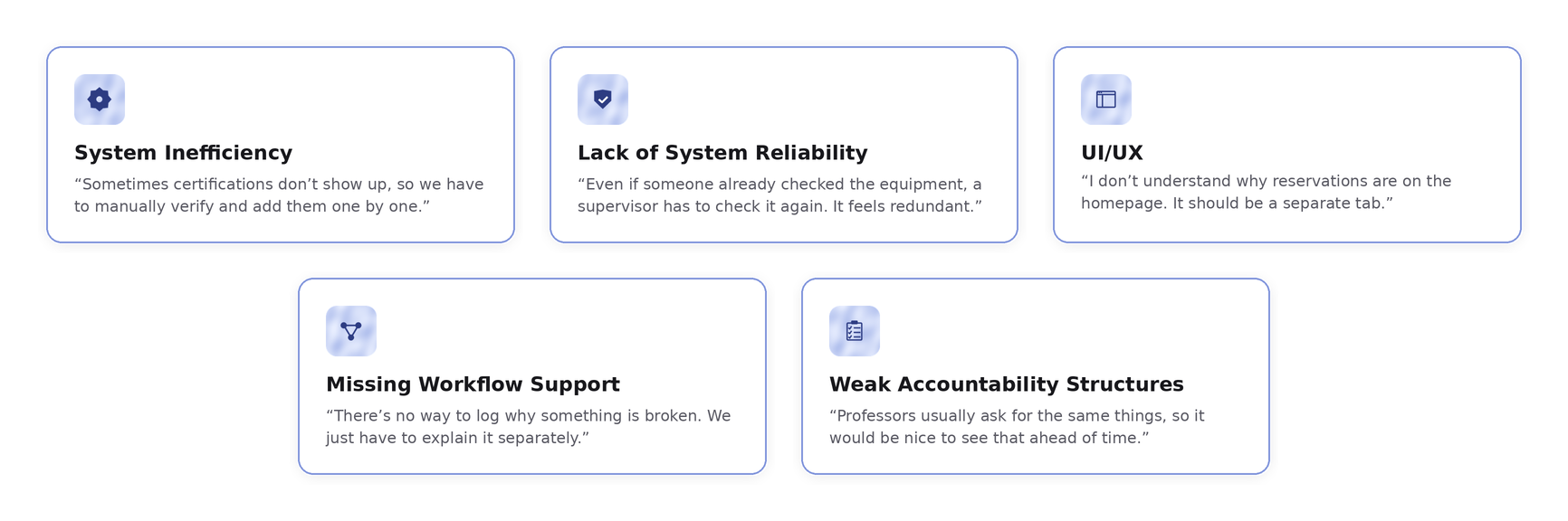
To understand user pain points, I went down to the IDM lab and asked for permission to record a session of them setting up a reservation for a student. I monitored the way they navigated the pages, paused out of confusion or frustration, and noted what they said was causing them the biggest headache.
User Testimonials
Translating Research into Design
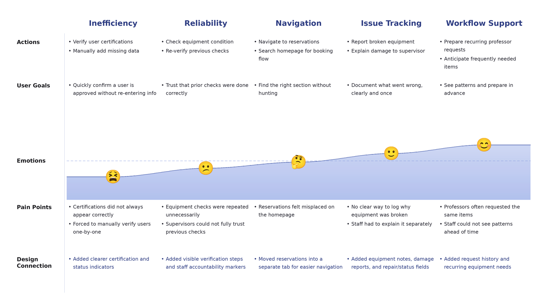
After mapping how users moved through the system, I synthesized the testimonials and observed pain points into a user journey map. This view tracks each stage of the staff experience, what users were doing, what they were trying to accomplish, how they felt at each point, and where the friction was sharpest.
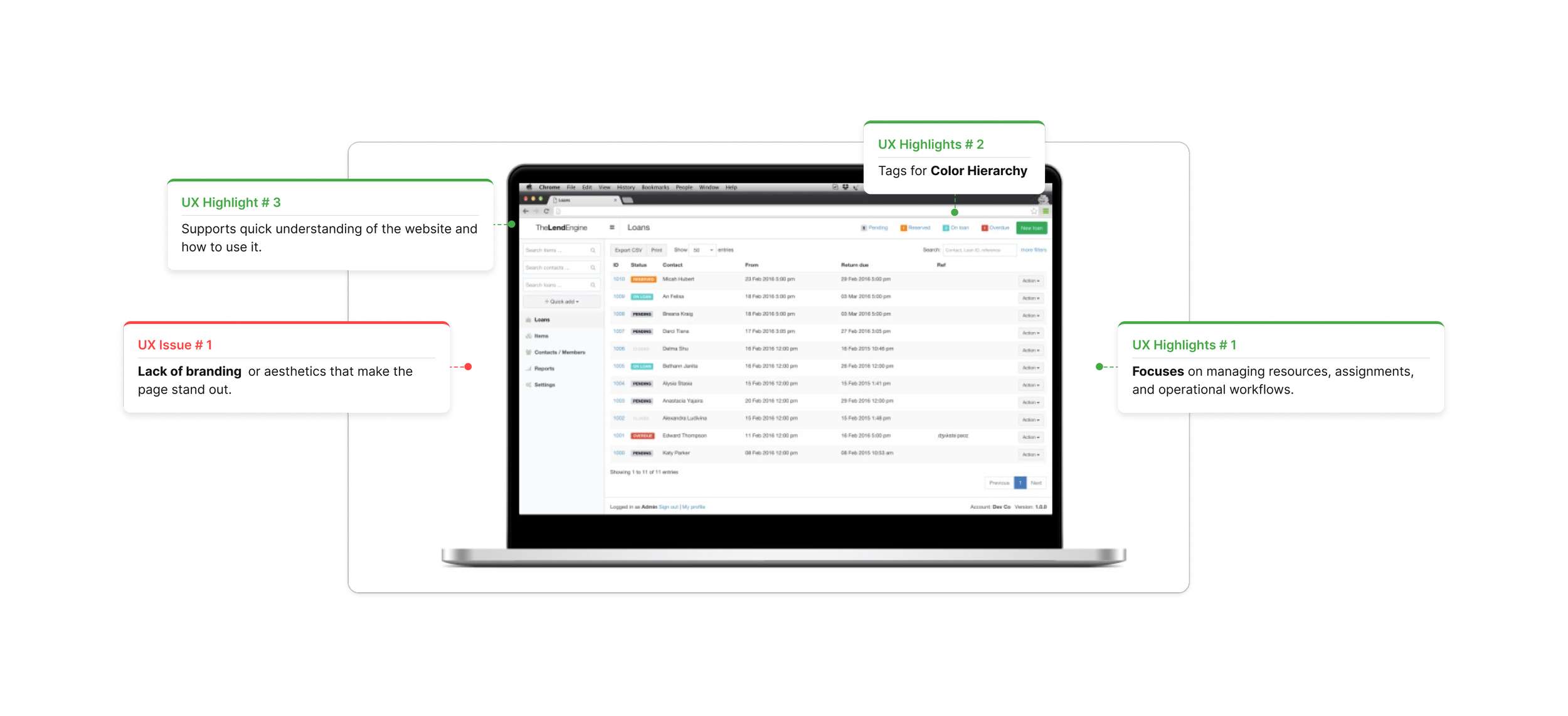
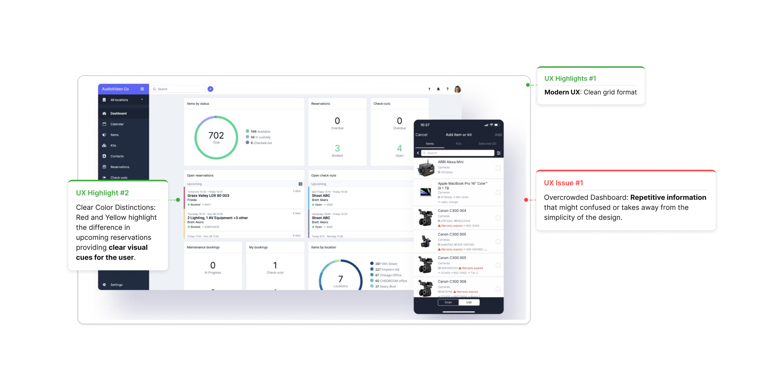
Competitive UX Analysis: What is the Industry Standard?
Cheqroom
Lend Engine
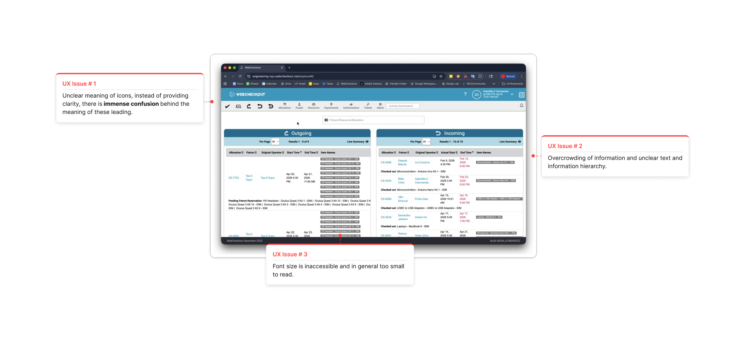
UX Analysis: How does WebCheckOut Fall Short?
Key Takeaway
The redesign focused on making WebCheckOut more reliable, organized, and accountable for staff managing equipment checkouts. Additionally, focus on incorporating solutions to the issues the competitors have.
Ideation & Exploring
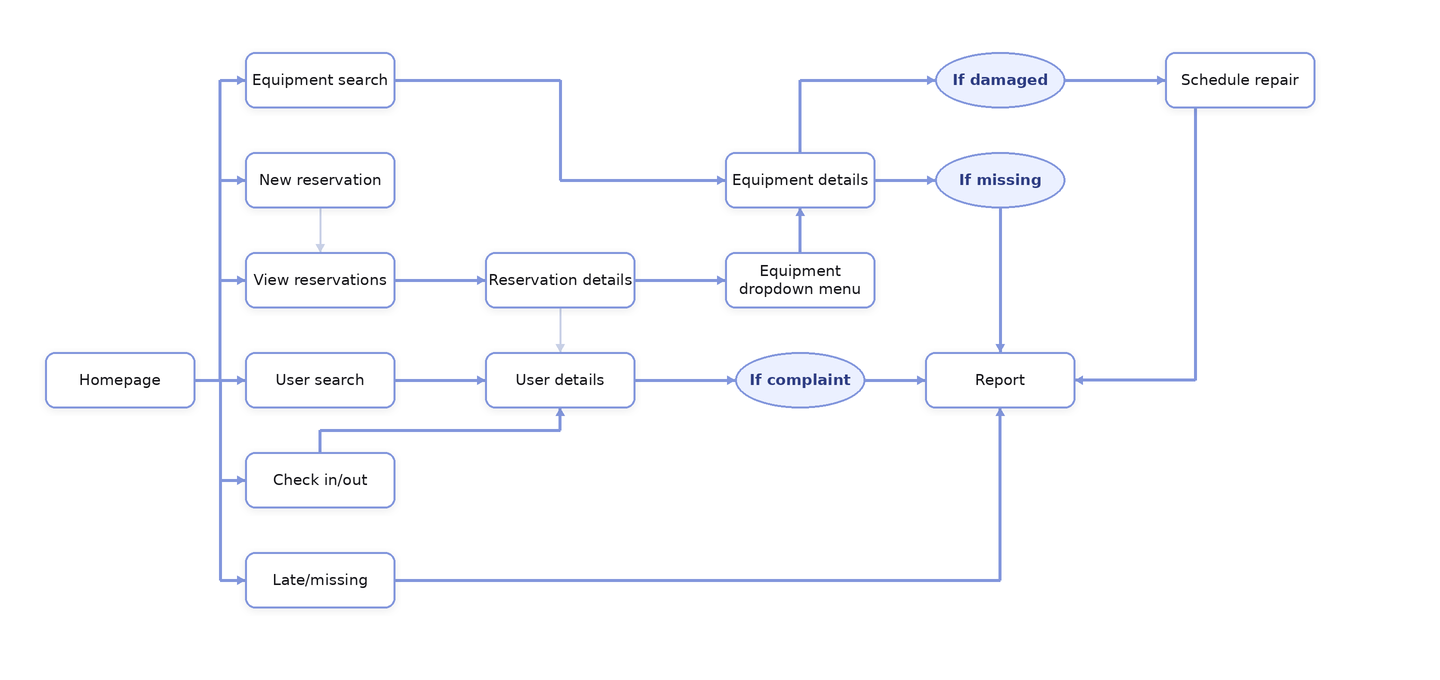
Userflow: Brainstorming User’s Workflow
The user flow maps how staff move through the checkout process, from viewing reservations and verifying user eligibility to checking equipment status, logging issues, and completing the handoff. It helped identify where the current system creates confusion and where the redesign needed clearer steps, faster actions, and better accountability.
Key Takeaway
Creating the user flow helped me understand that the checkout process was not just a single action, but a sequence of decisions involving reservations, user eligibility, equipment status, and staff approval. Mapping the flow made it easier to see where the current system creates repeated steps or unclear handoffs, which helped guide the redesign toward a more organized and accountable workflow.
Prototyping & User-testing
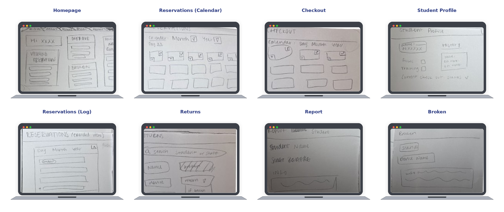
Paper Prototypes: Thinking Out Loud
To explore how users move through the app, I created a paper prototype that maps the main points, prioritizing functionality over aesthetics.
Key Insights
Checkout flow was easy to follow: Users understood how staff would move from reservations to equipment checkout.
Dashboard needed clearer prioritization: Pending reservations, overdue items, and urgent tasks needed to appear first.
Navigation needed more consistency: Users wanted clearer back buttons, tabs, and exit points between screens.
Equipment details needed more visibility: Availability, certification requirements, and damage notes needed to be easier to scan.
Lo-Fidelity Prototype
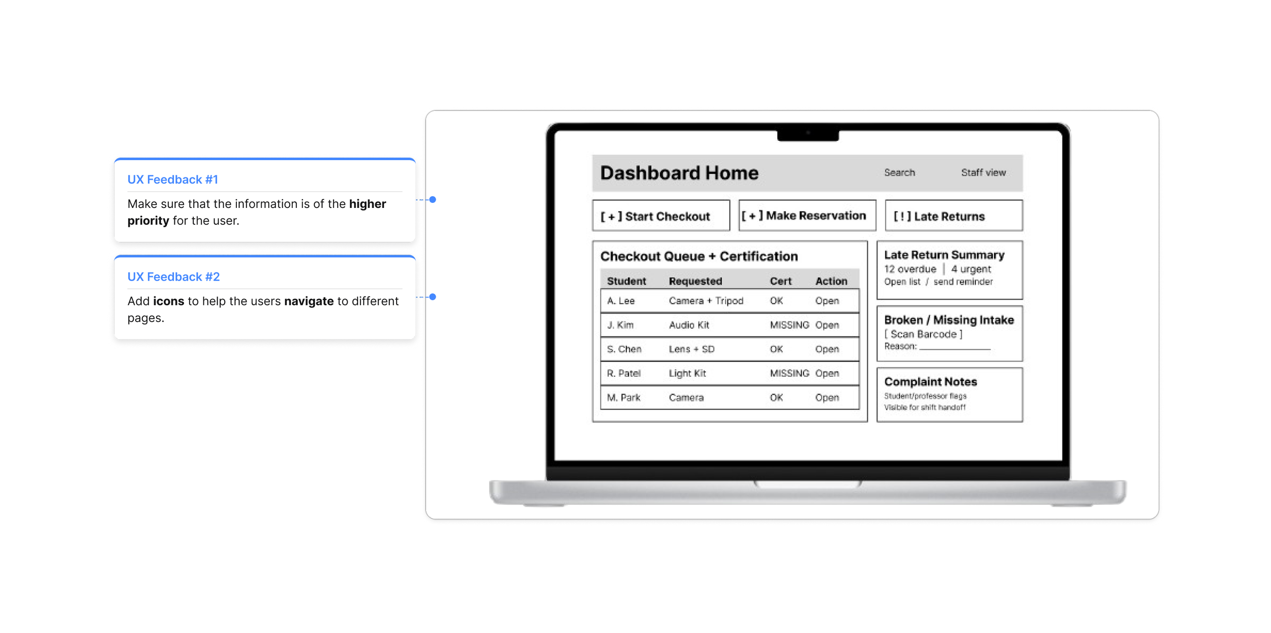
Dashboard Before

Dashboard After
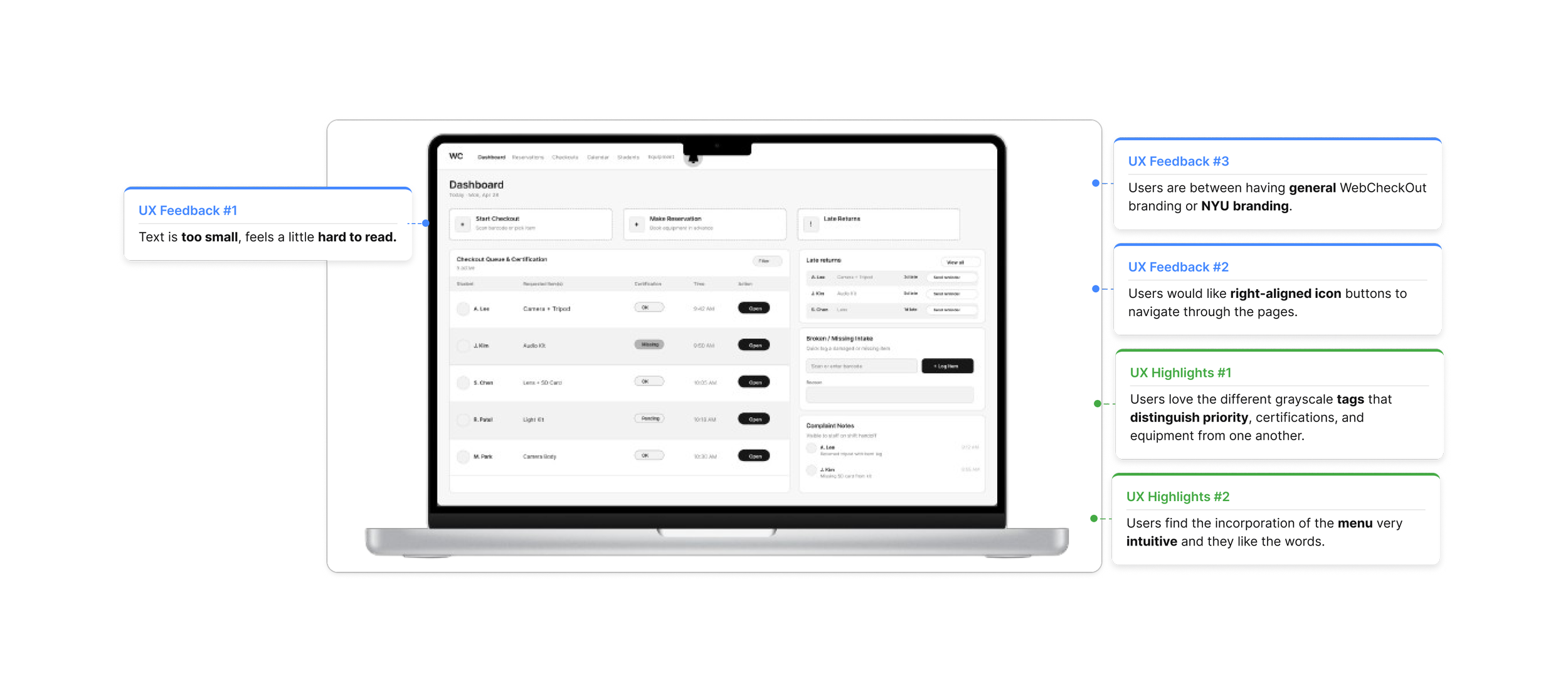
My Design Decision
Prioritizing the right information turns a wall of data into a glanceable command center.
Calendar Before
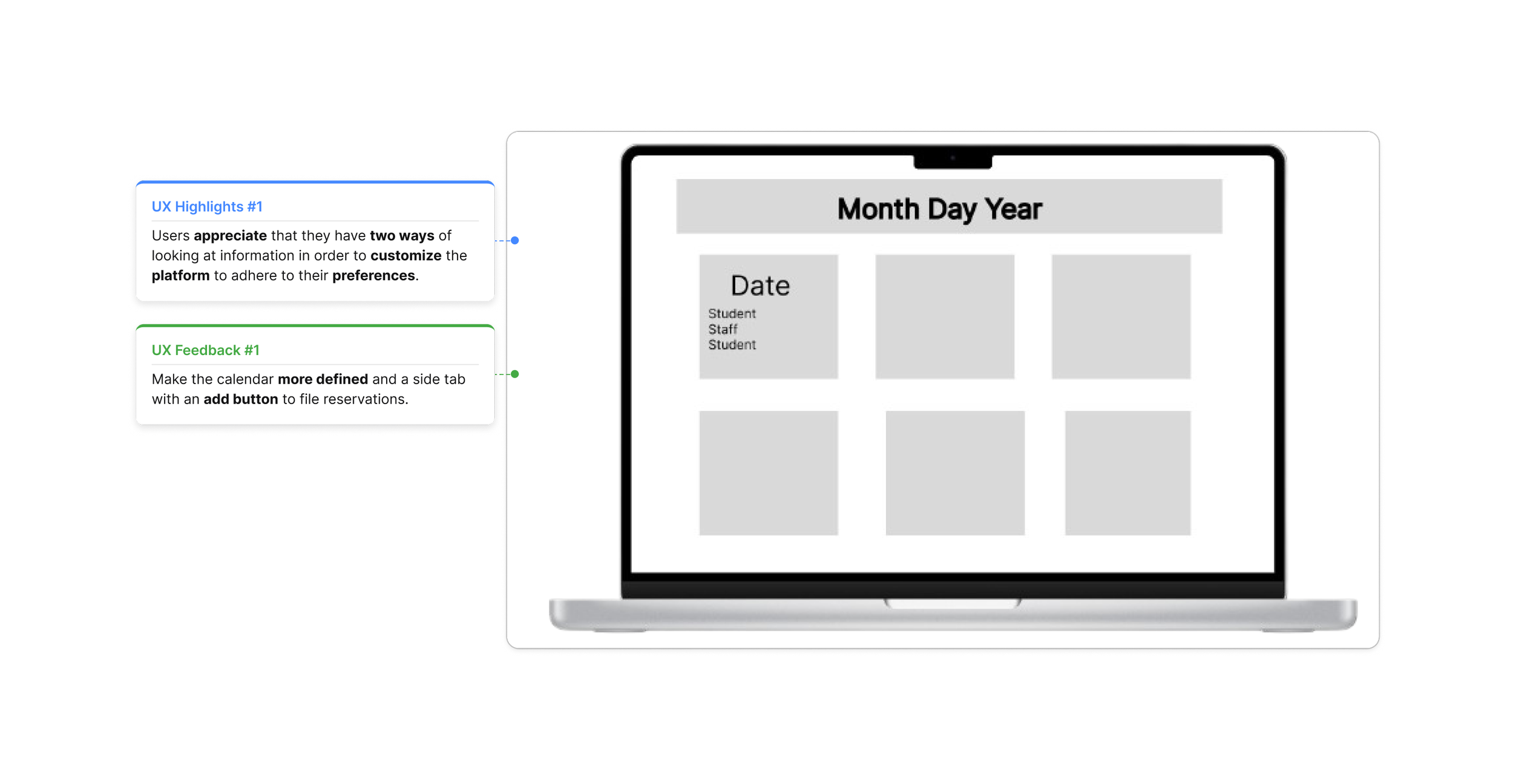
Calendar After
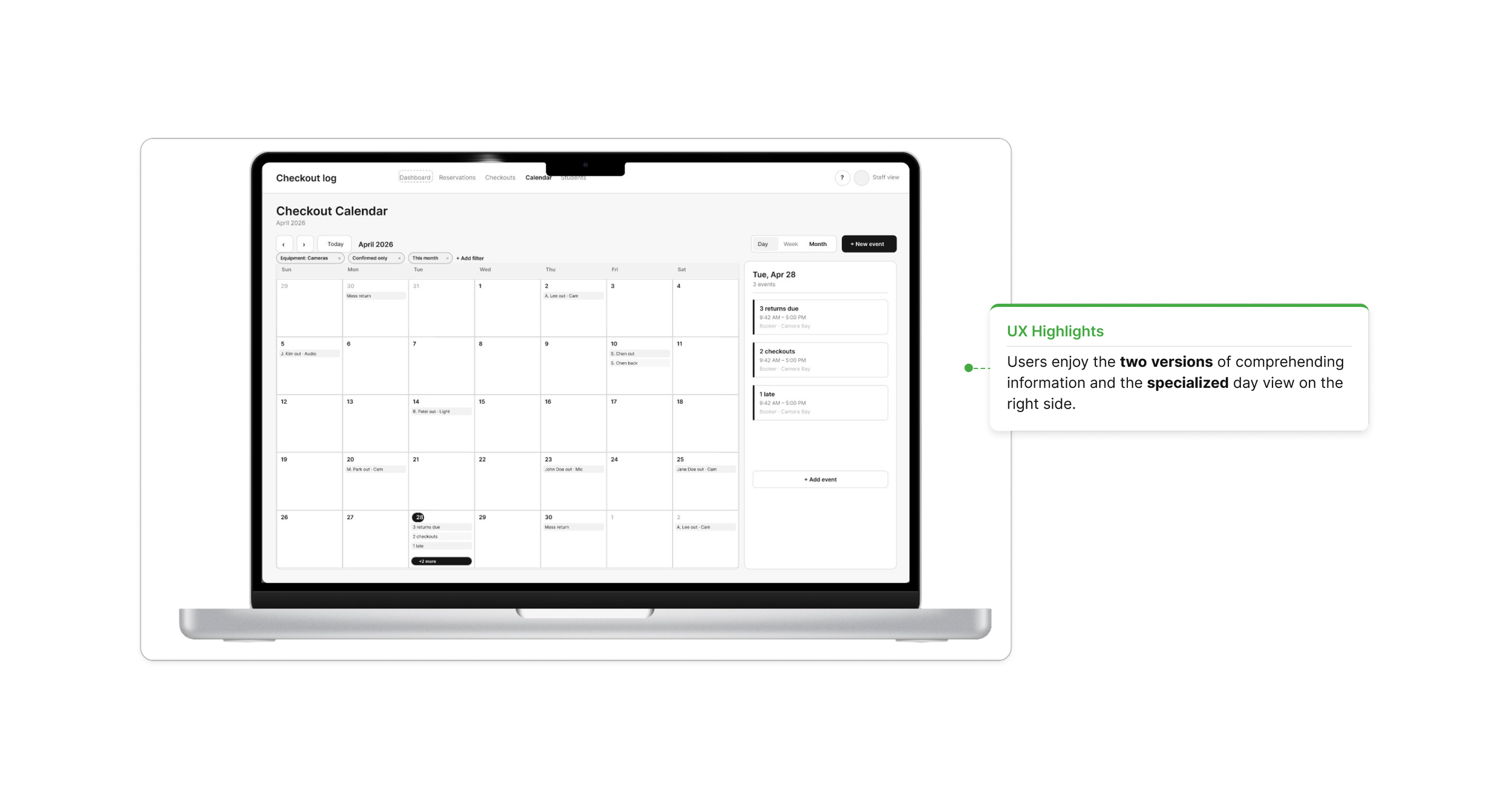
My Design Decision
Prioritizes two ways for the user to customize their data, making the design stand out.
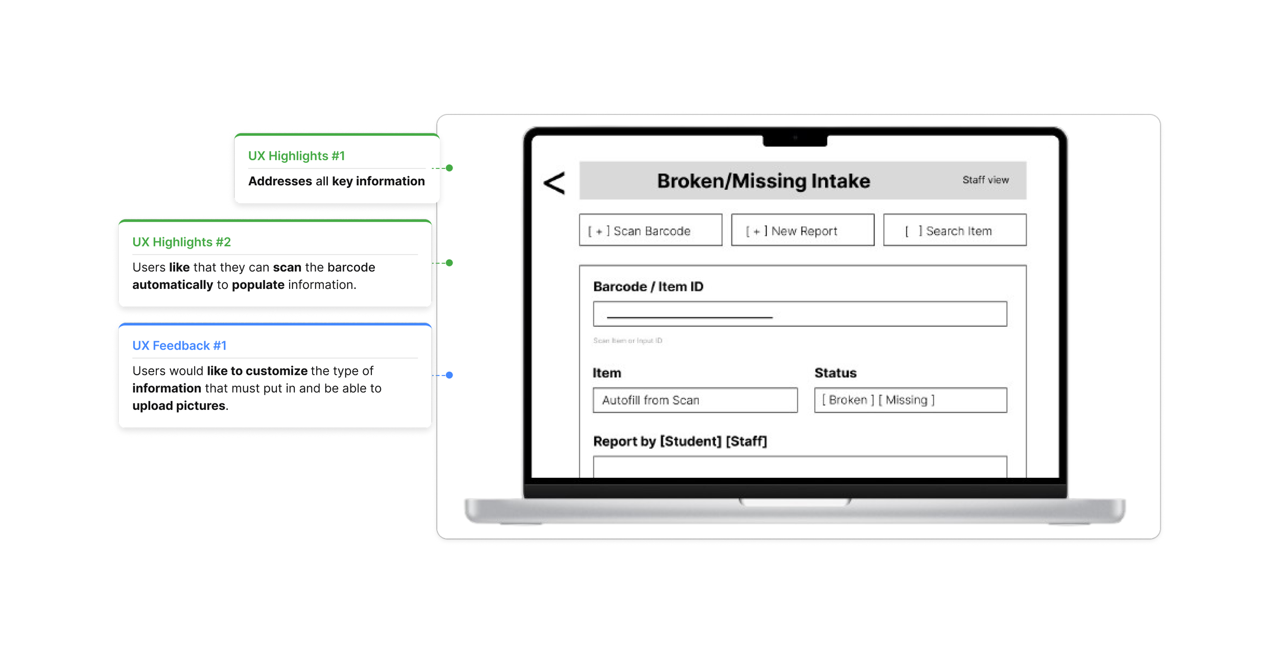
Broken/Missing Before
Broken/Missing After
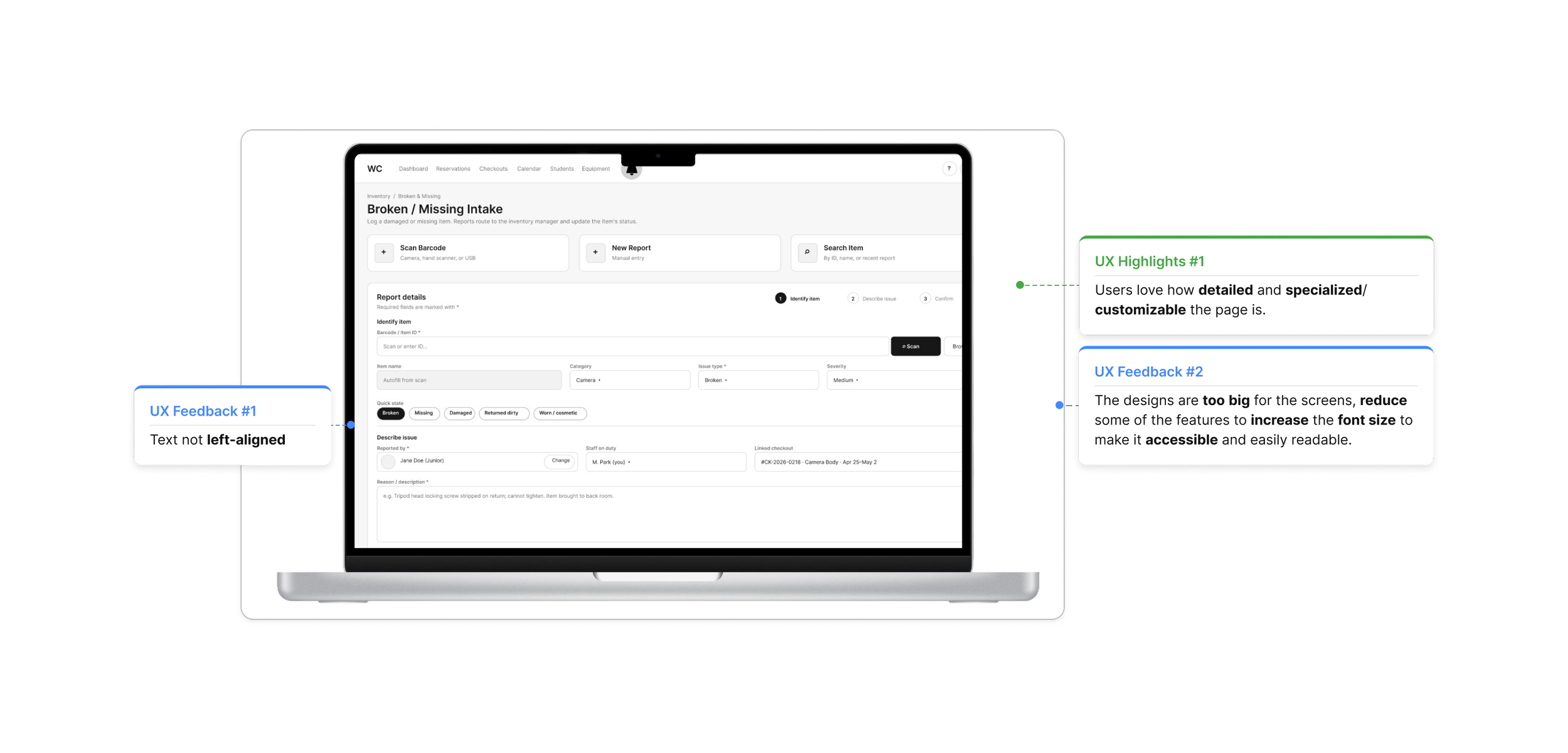
My Design Decision
Exceeds the expected tools by providing multiple ways to upload and catalog equipment information.
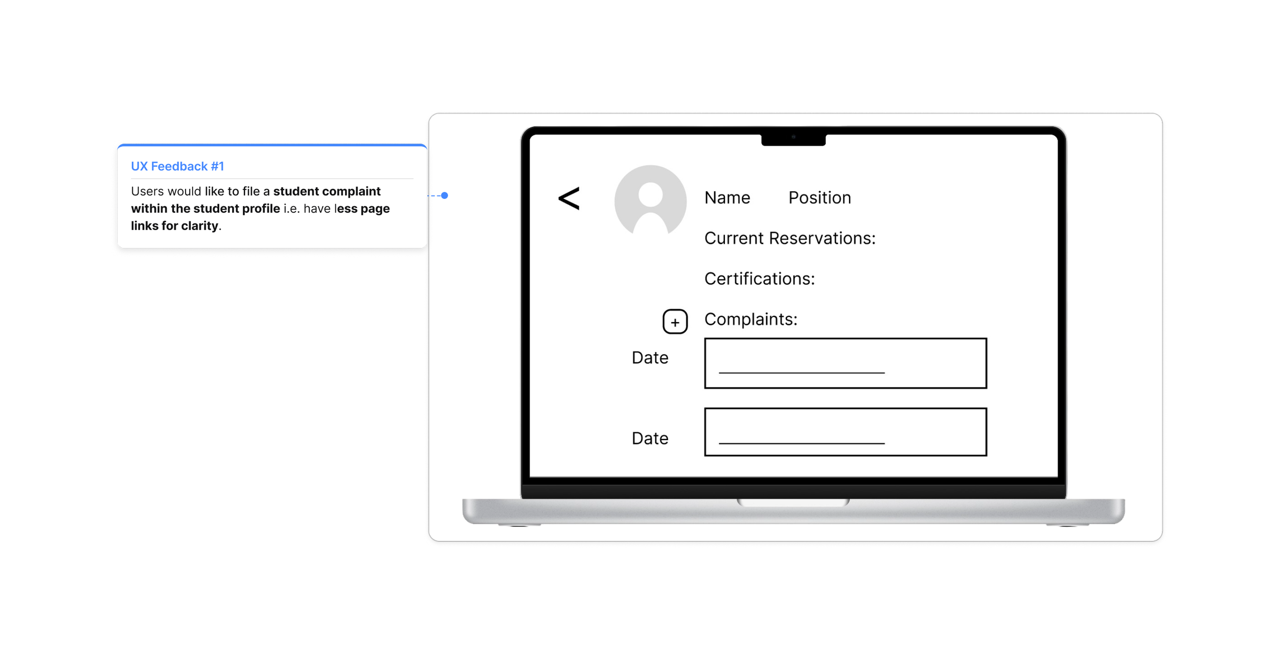
Student Profile Before
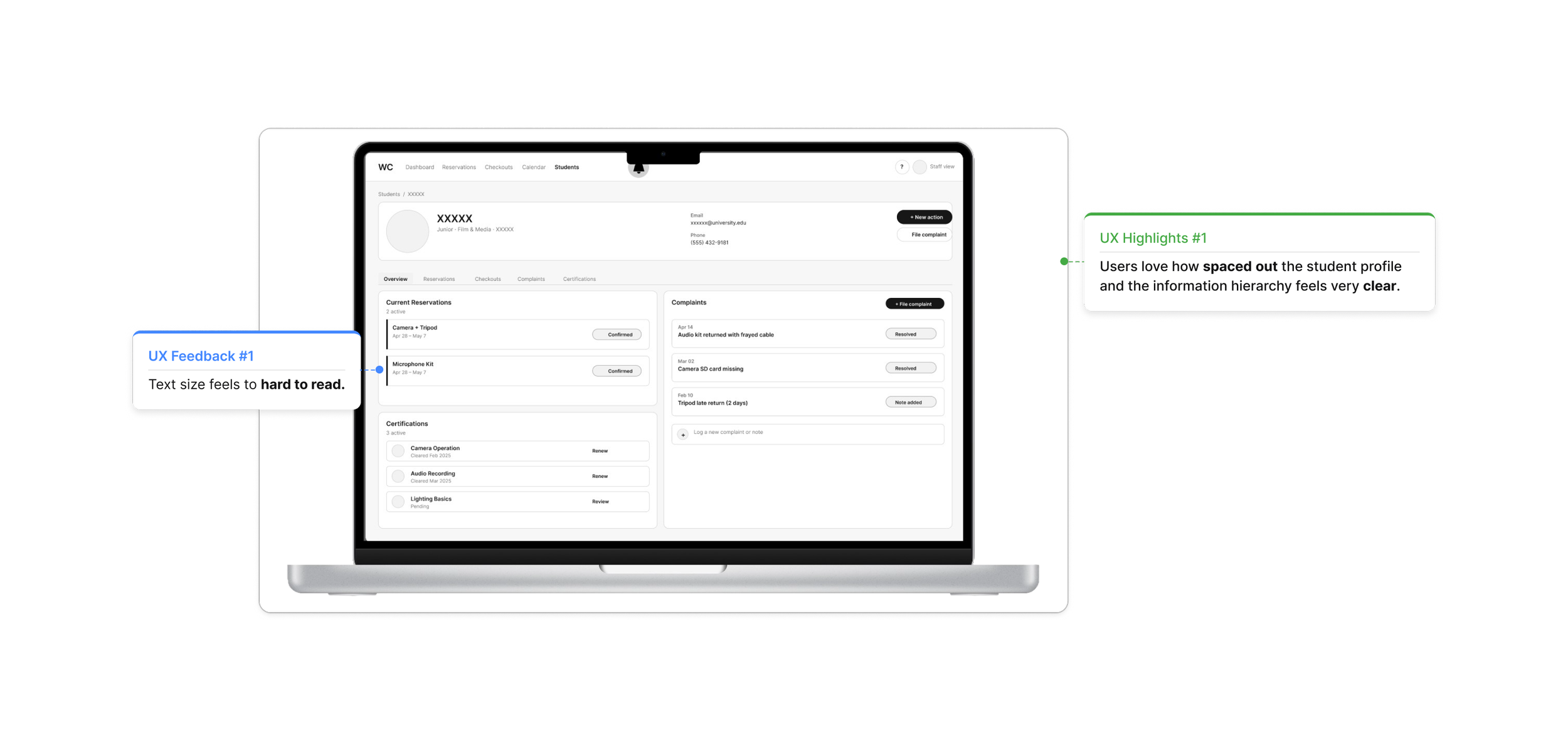
Student Profile After
My Design Decision
Allows users to file a complain within the student section and gives them the option of being redirected.
Usability Tests
Key Takeaway:
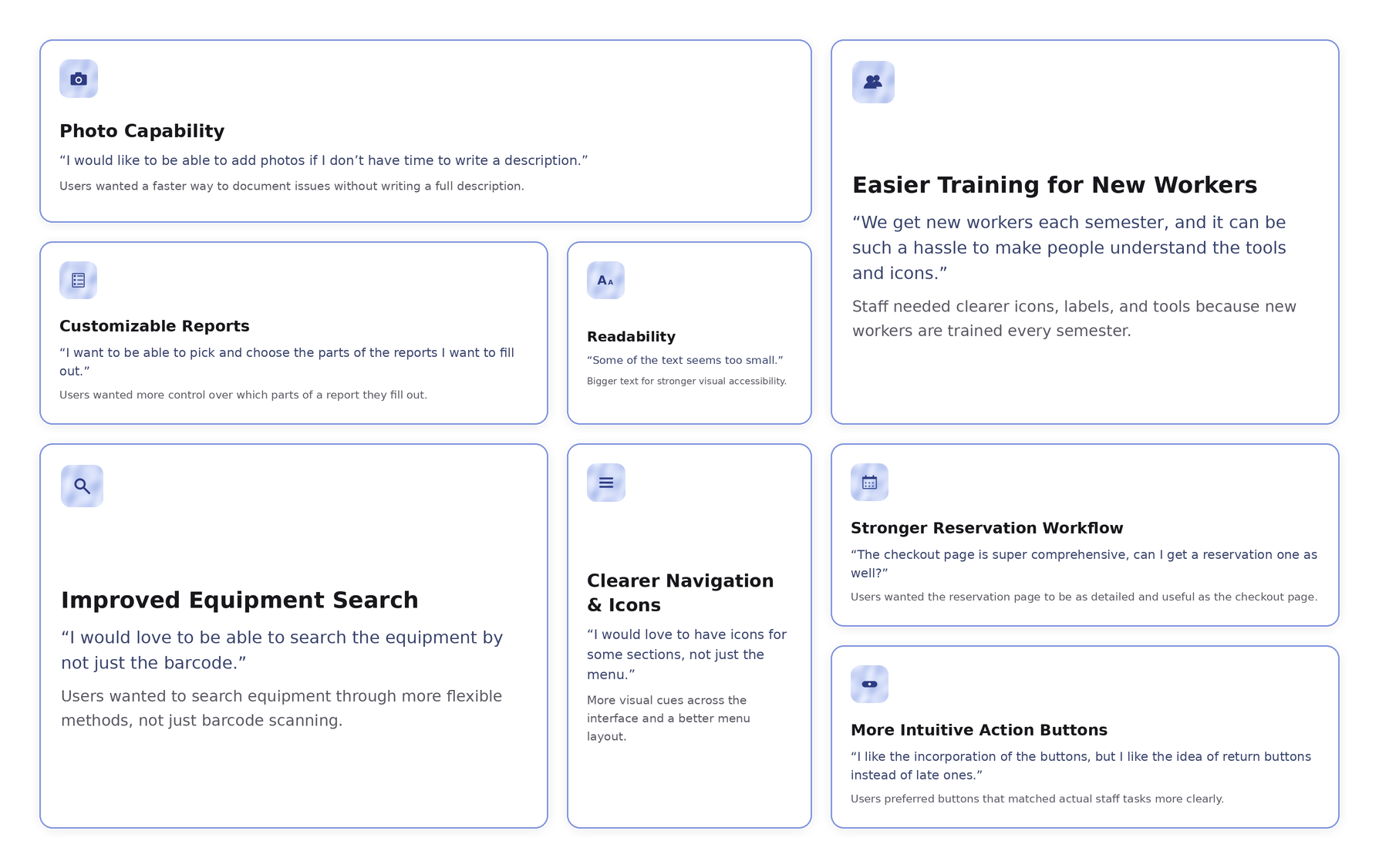
Testing showed that the redesign needed to focus on speed, clarity, and flexibility: faster issue reporting, clearer navigation, stronger readability, and workflows that better match how staff actually manage equipment.
Refinement
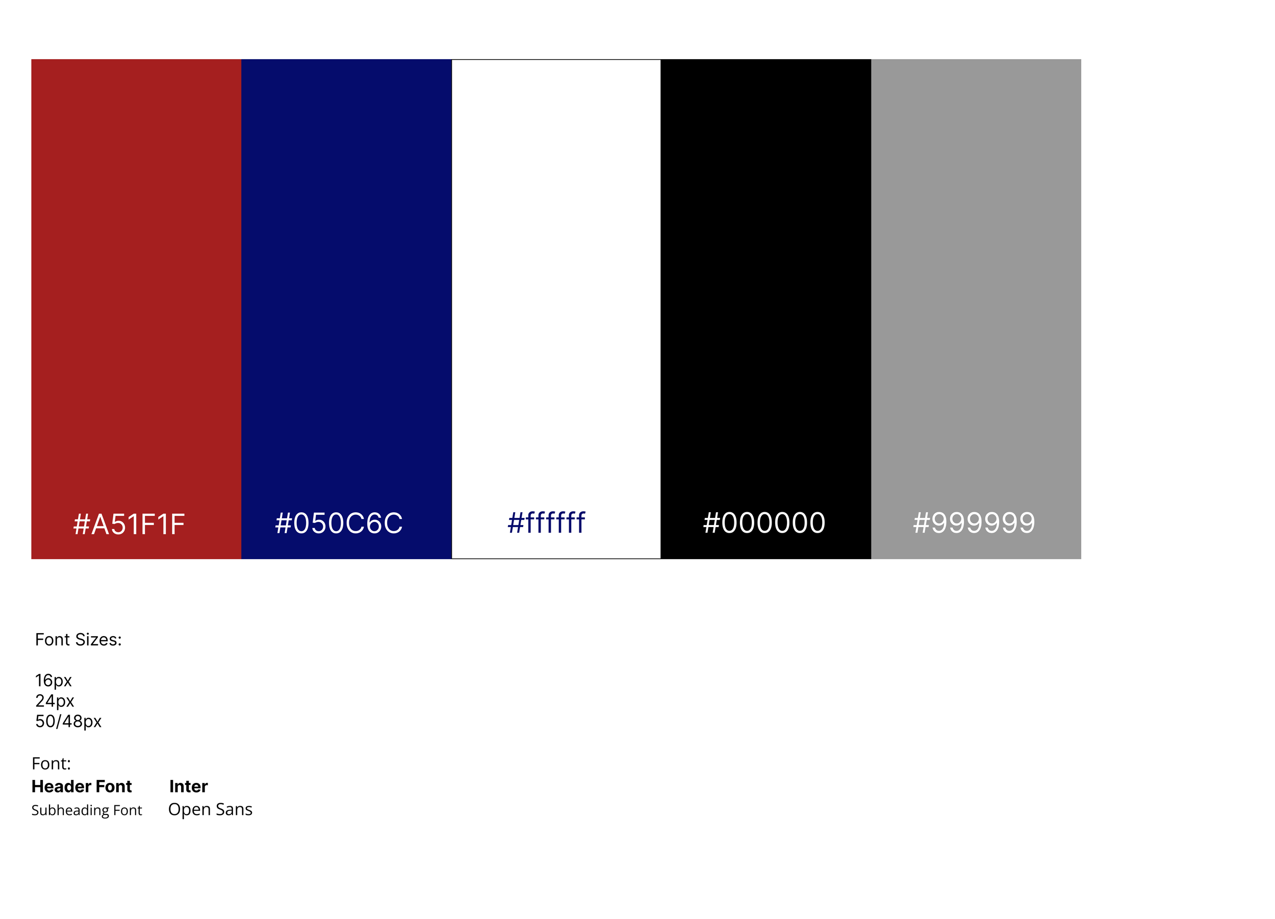
Visual Schematics: Color & Font
Color
Hi-Fidelity Video
Reflection
Users liked the addition of a log field because it made equipment issues easier to document.
The calendar feature helped support scheduling and reservation visibility.
Key functions were easy to access, which confirmed that the navigation was becoming clearer.
The group icons added visual contrast, but they felt slightly too large and needed better scaling.
Users wanted the text to be a little bigger for improved readability.
The interface needed stronger visual contrast to make information easier to scan.
Users suggested using NYU colors to make the platform feel more connected to the school’s identity.
Key Takeaway:
This round of feedback showed that the redesign was successful in making core staff tasks more accessible, especially through the log field, calendar, and clearer navigation. Moving forward, the main focus was refining the visual system by improving text size, adjusting icon scale, increasing contrast, and aligning the interface more closely with NYU branding.