NYU Homepage
Combining the most important components of a student’s life together.
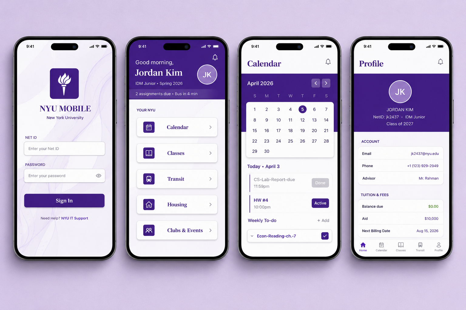
Individual Project
Role: Co-Product Designer Timeline: 3 Weeks Tools: Figma, Figjam
Overview
The NYU Homepage redesign reimagines a fragmented student-facing platform into a centralized, mobile-first student portal. Instead of requiring students to move between Albert, Brightspace, NYU Home, shuttle tracking, and housing portals, the redesign consolidates daily academic and campus workflows into one SaaS-style dashboard experience.
Impact
Consolidated 5+ disconnected student platforms into one mobile-first dashboard experience.
Designed 10+ high-fidelity screens across login, dashboard, calendar, classes, events, housing, profile, and task management.
Improved information architecture by replacing grid-based navigation with a more scannable list structure.
Reduced login friction with a single sign-in flow that takes users directly to the dashboard.
Strengthened task management with priority-based to-dos, proactive reminders, and calendar-based workflows.
Connected events, notifications, and scheduling through an RSVP-to-calendar engagement flow.
The Challenge
Fragmented. Frustrating. Outdated.
Students navigate 5+ disconnected platforms daily.
Albert. Brightspace. NYU Home. Shuttle tracker. Housing portal.
No single place. No unified login. No mobile-first design.
The Opportunity
NYU students need a faster, more unified way to manage daily campus life. Instead of moving between disconnected platforms for classes, assignments, transit, housing, and account information, the mobile experience could serve as a centralized student dashboard, reducing friction, improving clarity, and making essential tools easier to access on the go.

Process
UX Interviews → UX Analysis → Ideation → Prototyping → User-Testing → Refining → Reflection
Research & Understand
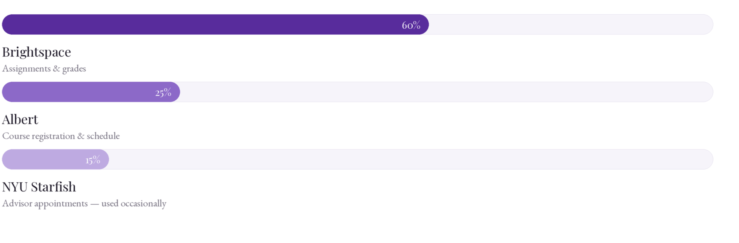
Survey: How Often Do Students use NYU Platforms?
Key Takeaway
Most people use Brightspace to access assignments, syllabus information, and grades, therefore, this section would need to be the most thought out and intuitive when integrating different NYU platforms into a centralized dashboard.
Competitive UX Analysis: What is the Industry Standard?
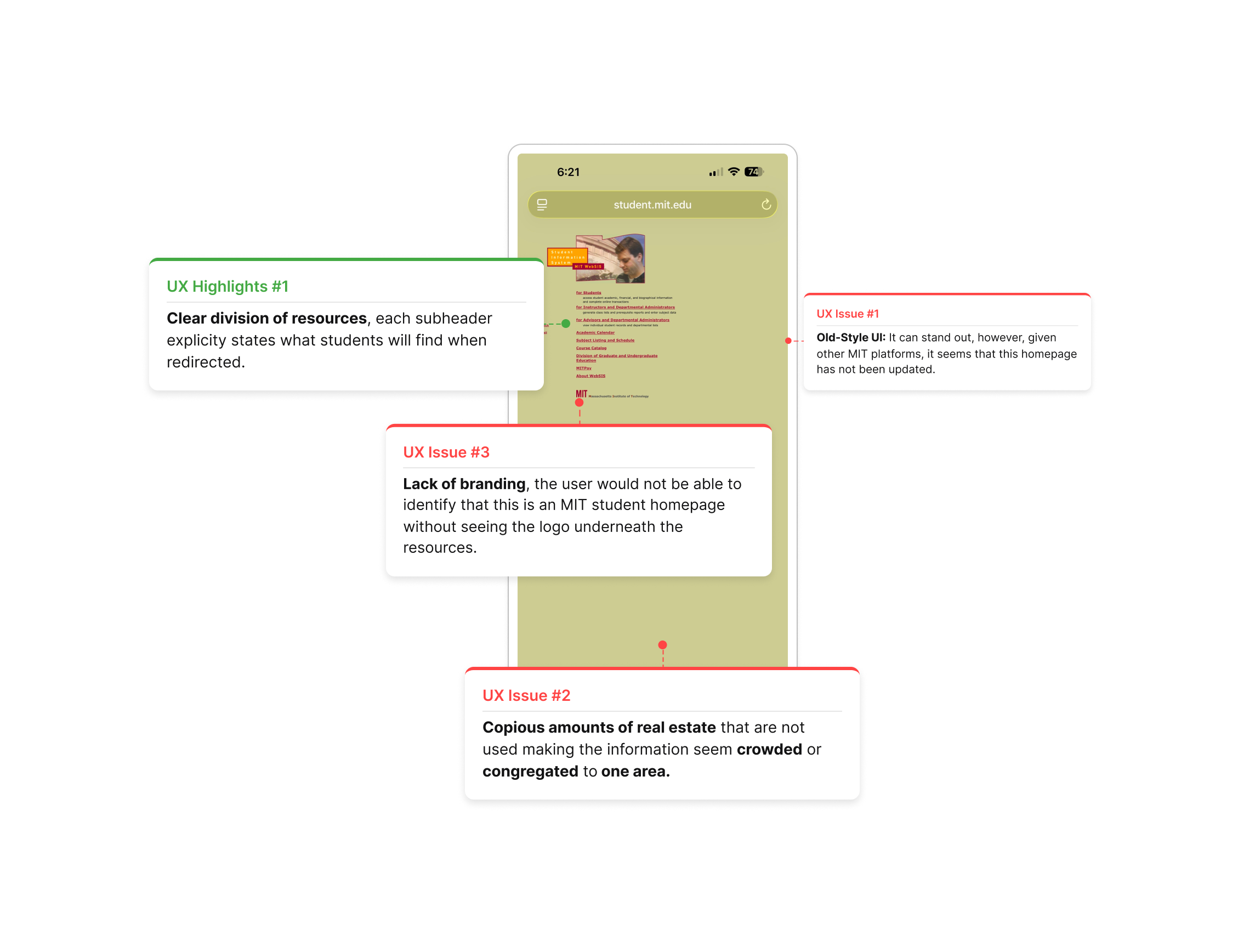
MIT Student Homepage
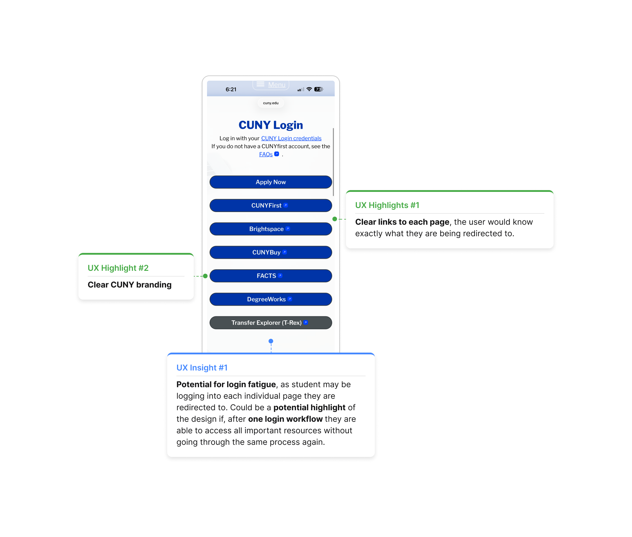
CUNY Homepage
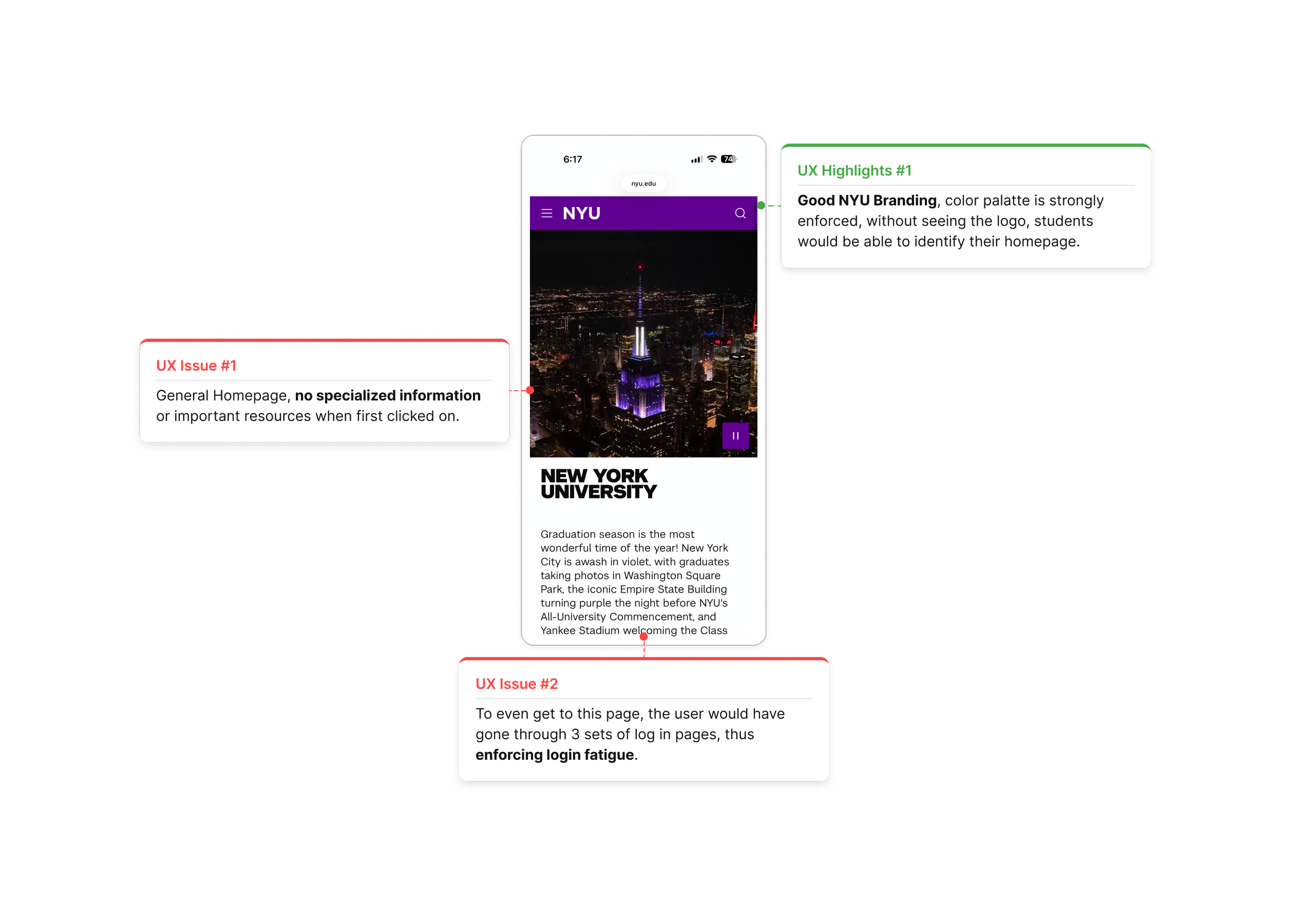
UX Analysis: Where does the NYU Homepage Fall Short?
Key Takeaway
Most people use Brightspace to access assignments, syllabus information, and grades, therefore, this section would need to be the most thought out and intuitive when integrating different NYU platforms into a centralized dashboard.
Ideation & Exploring
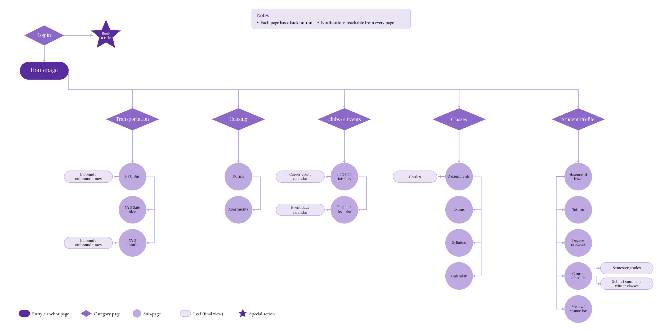
Userflow: Brainstorming User’s Workflow
To understand how users would move through the mobile, I created an initial flow mapping key screens and features. The flow begins at the login page and branches into a central comprehensive dashboard.
Prototyping & User-testing
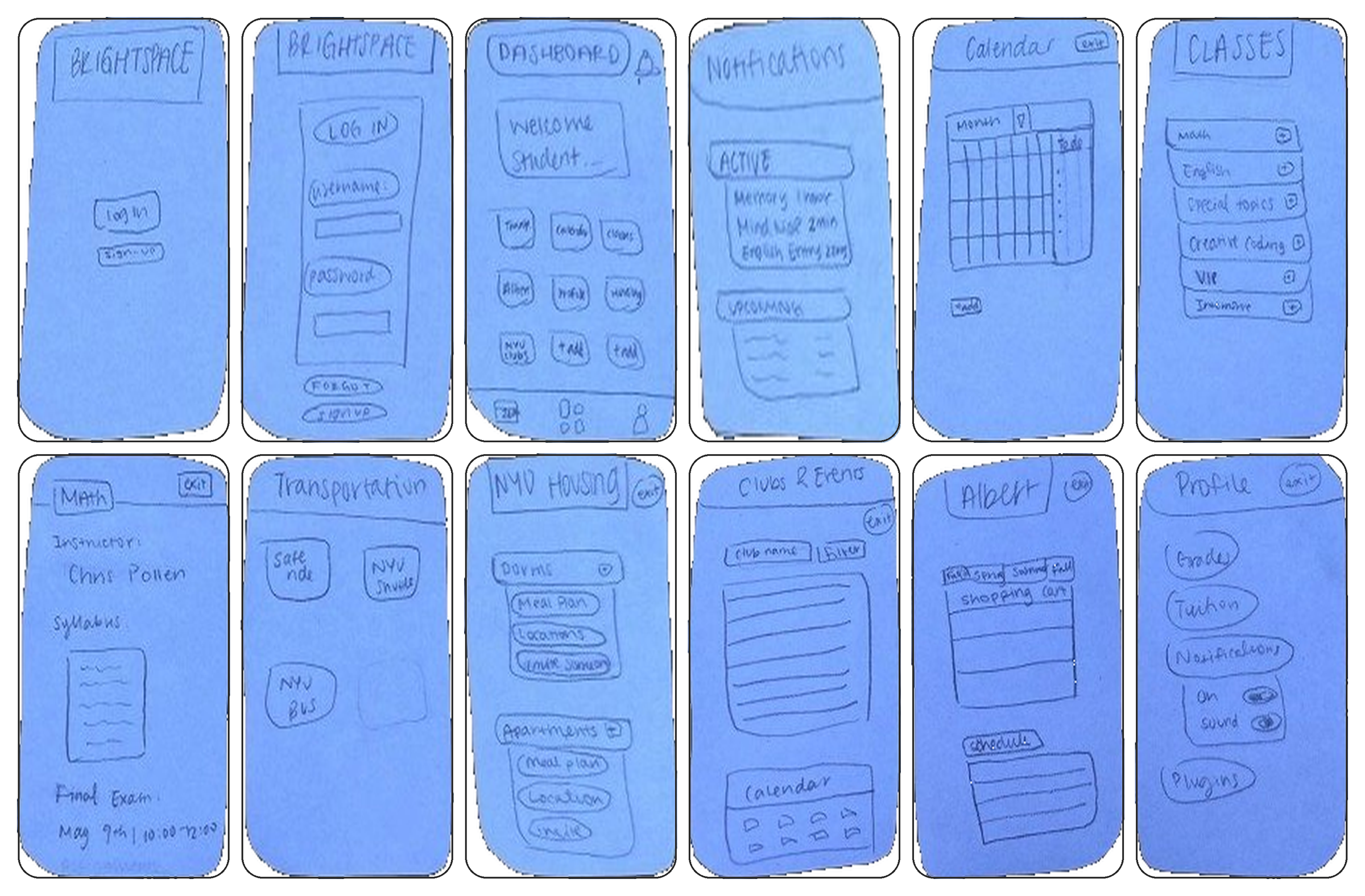
Paper Prototypes: Understanding how Identity and Creativity are Impacted
To explore how users move through the app, I created a paper prototype that maps a creative journey from a central dashboard into personal or shared spaces for accountability and expression, ending with a profile area that reflects progress and evolving identity.
User Testing
To evaluate the early concept, I tested the prototype with two students to understand whether the dashboard, navigation, and key features felt intuitive and useful.
Testing Goals
Determine whether the main buttons and interface were easy to understand.
Evaluate whether calendar, classes, and secondary tools were easy to access.
Identify whether the app included the information students needed most.
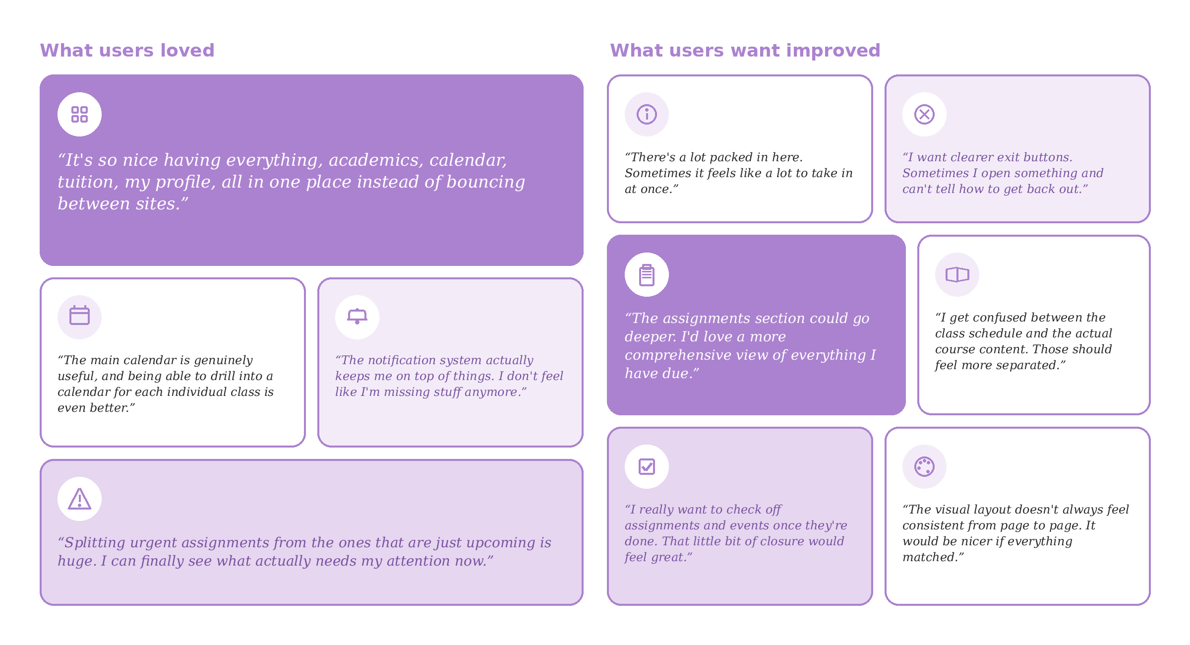
User Feedback
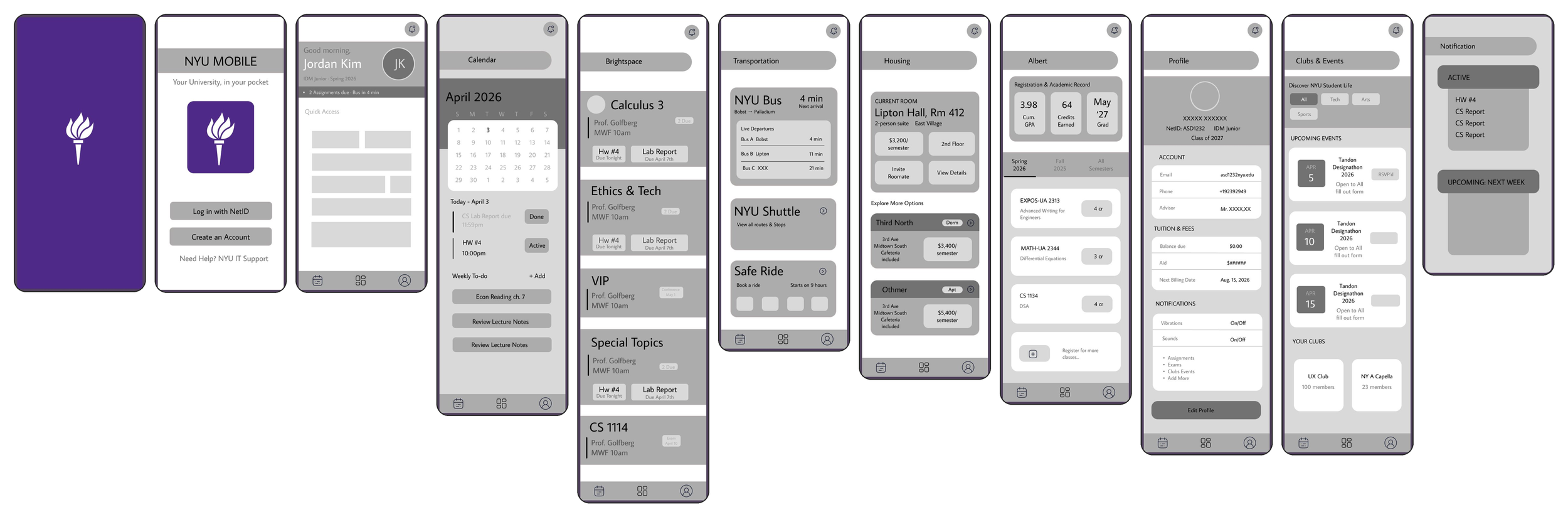
Lo-fidelity Prototype
Main Takeaways
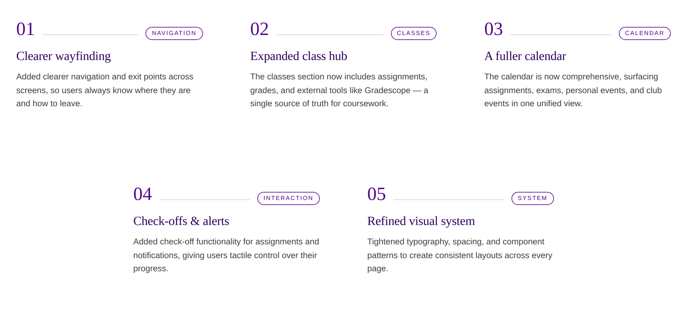
The testing showed that students valued a centralized academic hub, but the experience needed clearer organization and stronger task management. Based on this feedback, I focused on improving navigation consistency, expanding the classes and assignments sections, making the calendar more actionable, and reducing information overload through clearer hierarchy.
Key Design Decisions
User-Testing
After creating the low-fidelity prototype, I gathered feedback to evaluate whether the structure, navigation, and feature organization felt clear before moving into higher-fidelity screens.
Feedback Spotlights
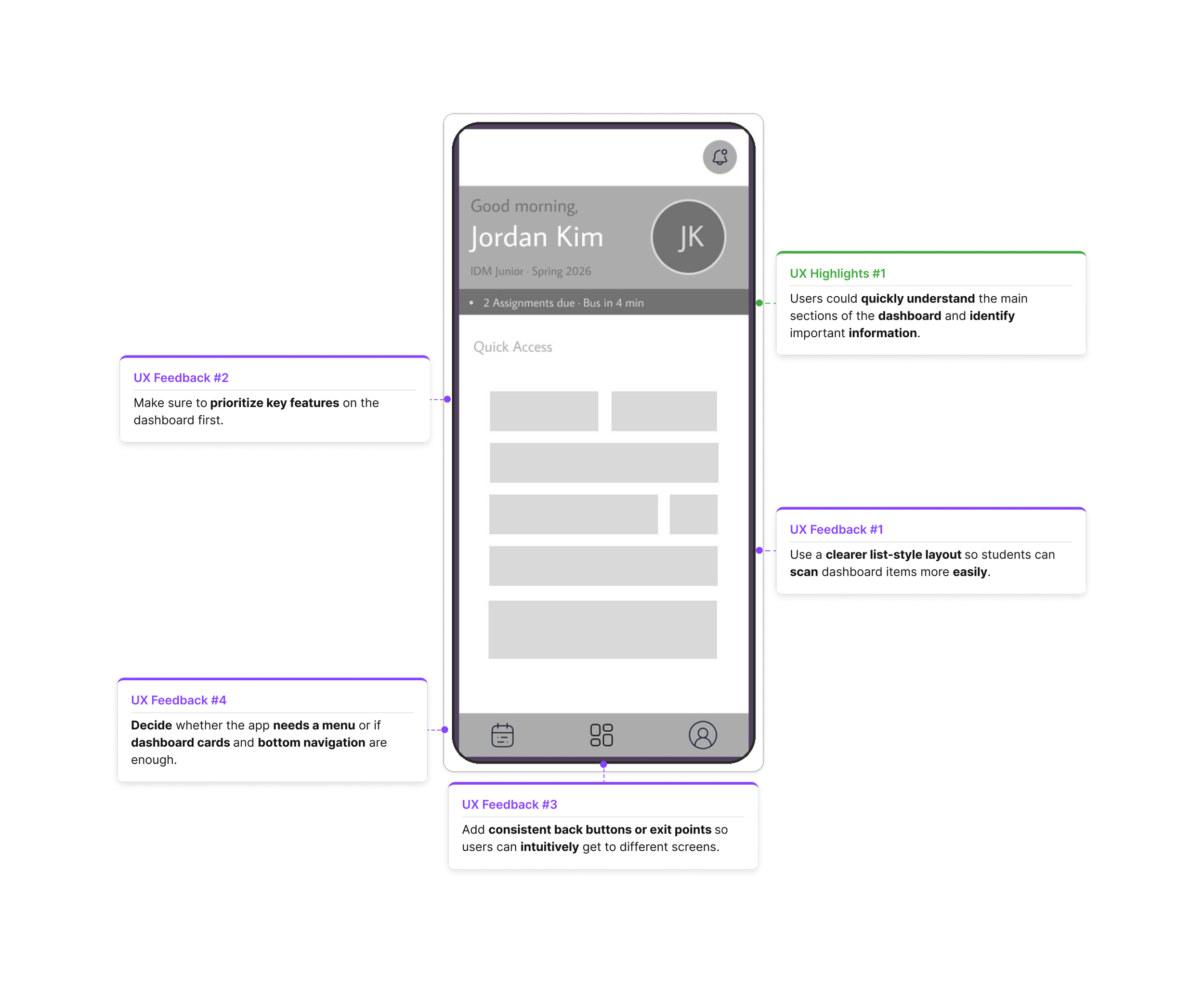
Dashboard
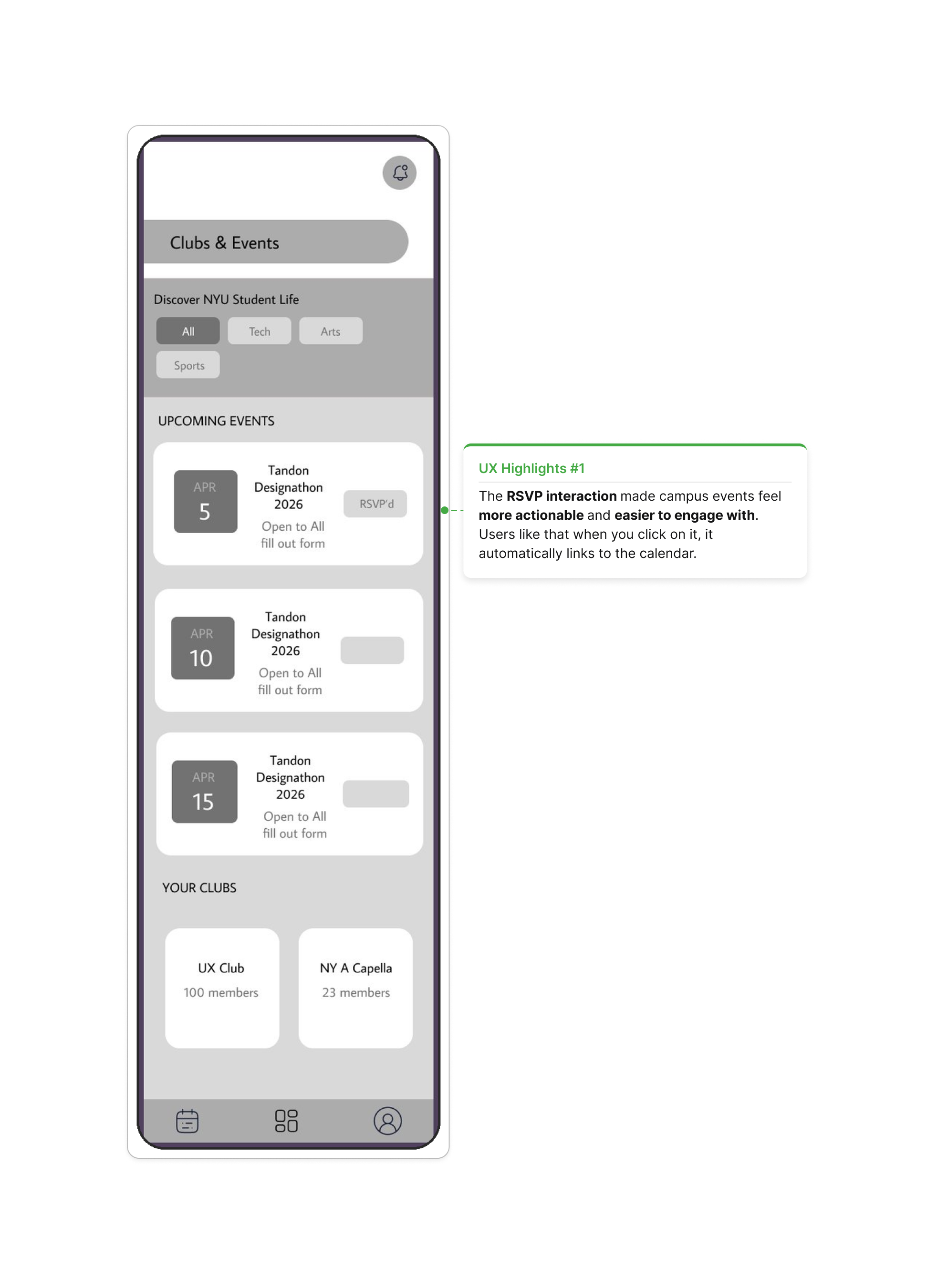
Clubs & Events
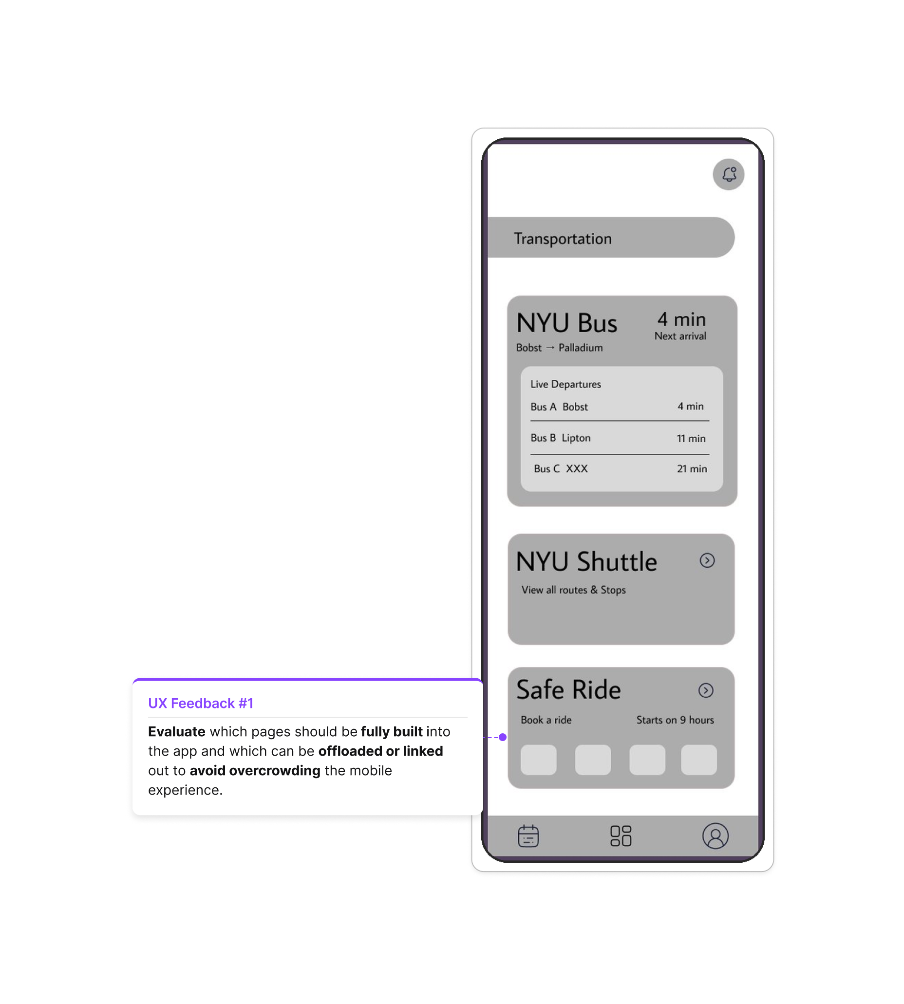
Transportation
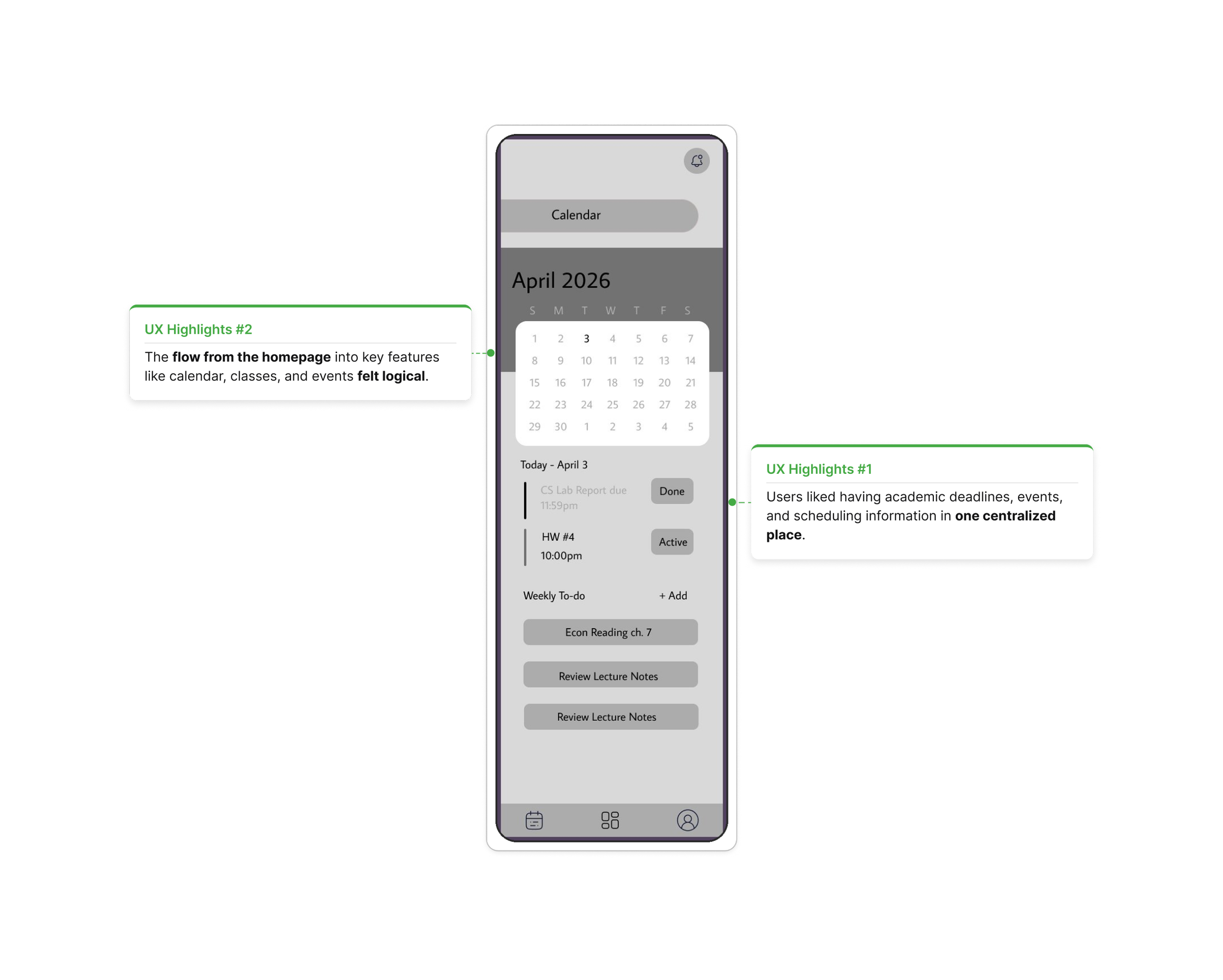
Calendar
Main Takeaway
User testing confirmed that the core concept was strong: students understood the dashboard, found the flow intuitive, and valued having calendar, classes, and events in one place. I focused on simplifying the dashboard, prioritizing the most urgent information first, adding clearer navigation patterns, and deciding which features should live directly in the app versus being linked out.
Refinement
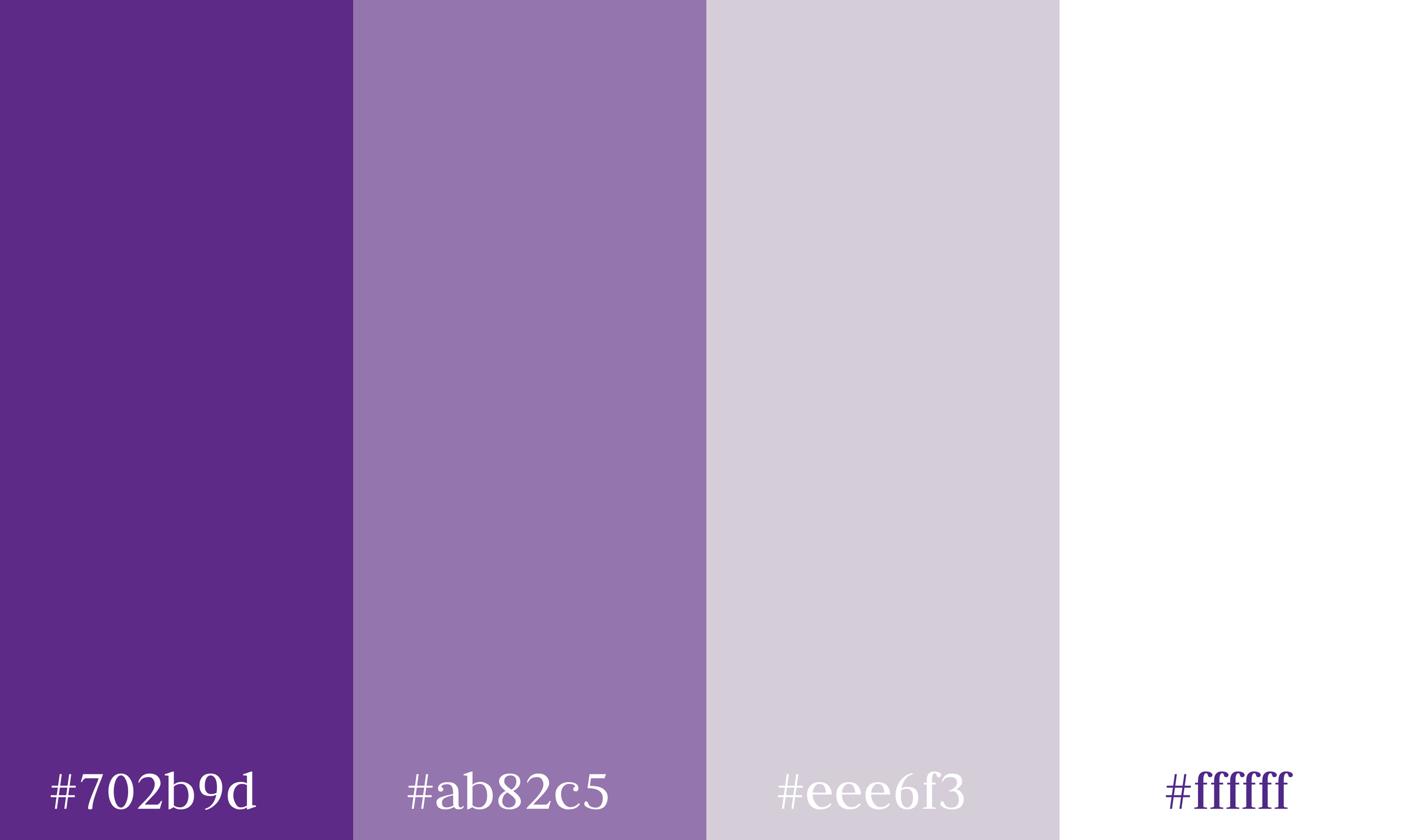
Visual Schematics: Color & Font
Color
Hi-Fidelity Video
Reflection
Key Design Decisions
List over grid: A list-based dashboard made important information easier to scan and prioritize.
Single login flow: Removing the signup screen created a faster path from login to dashboard.
Unified purple icon system: Keeping icons one color made the interface feel more consistent and aligned with NYU’s identity.
Bottom sheet overlay: Students could add tasks without leaving the calendar, making the flow feel smoother.
Priority-based to-do system: The left border color helped communicate urgency without overwhelming the screen.
RSVP to calendar flow: Events, notifications, and calendar updates became more connected and actionable.
Future Opportunities
Add proactive assignment reminders.
Explore more dynamic animated interactions.
Create adaptive color themes based on time of day.
Personalize the dashboard based on each student’s schedule, campus location, and most-used tools.
Takeaway
This project taught me that a strong redesign is not just about adding more features, but about organizing information so users can find what they need quickly, clearly, and with less friction.